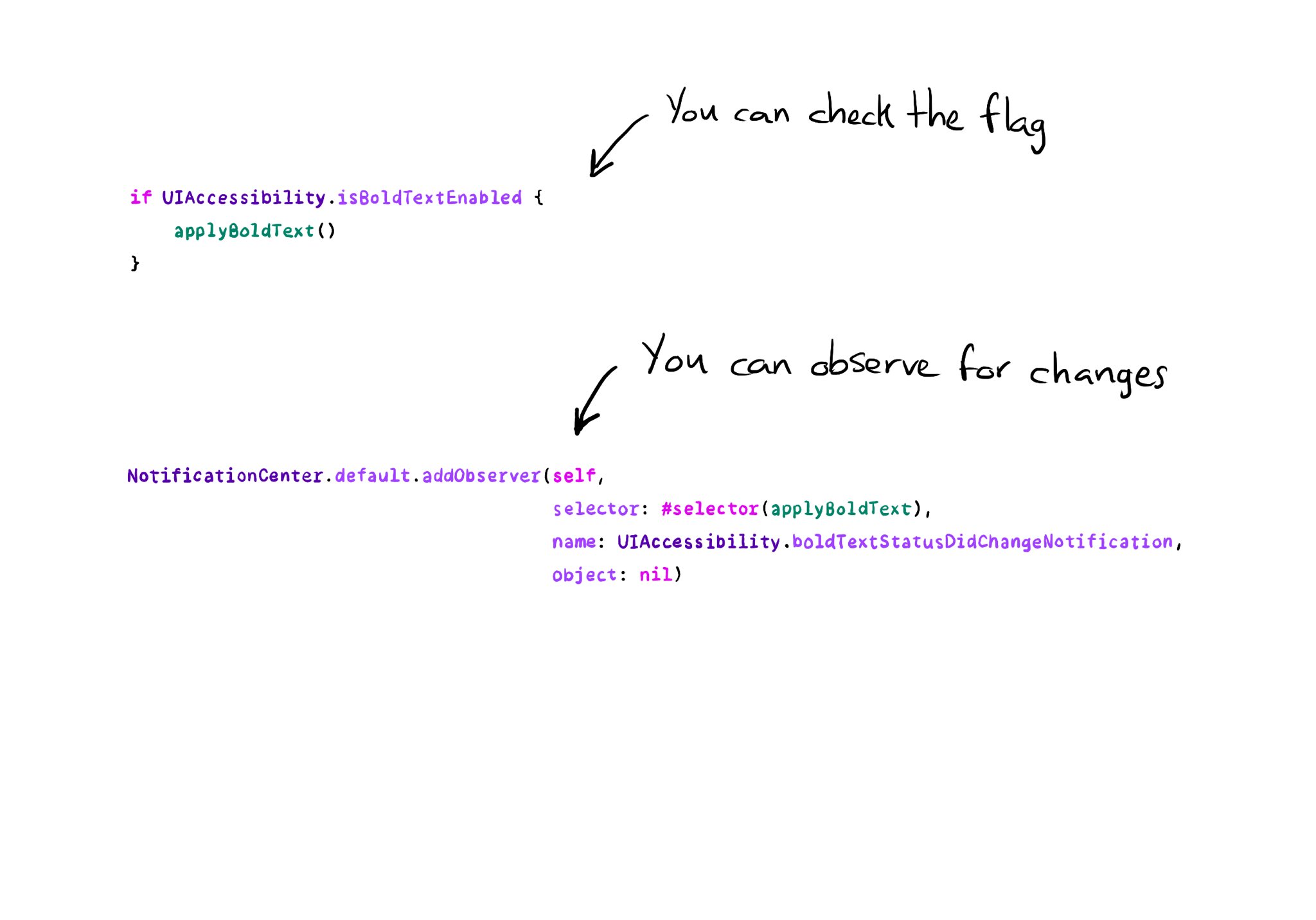
You can enable the possibility of providing assets for different appearances including light/dark modes and high contrast. As we've seen, that's valid for colors, but you can do the same for images too!

https://x.com/dadederk/status/1594724075590619138?s=20&t=XJrlJiGSCTR9sJC7XPZPjA
You may also find interesting...

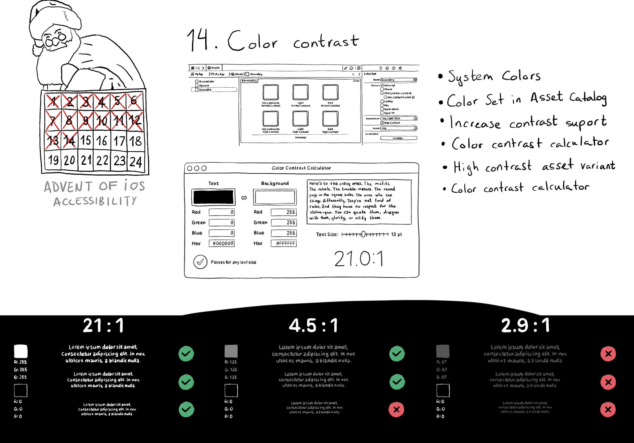
iOS and Xcode provide a wide variety of tools and options to deal with color contrast ratios. From system colors, that automatically support Increase Contrast, to high contrast color and asset variants, and even a built-in contrast calculator.

Make sure you support Dynamic Type up to the largest text size available. Take into account that there are five extra accessibility sizes available from the Accessibility Settings. It can make a huge difference for lots of users.

Hacks are accessibility’s worst enemy. An example. There is a ‘trick’ floating on the internet: if you want a button with an icon to the right of the text, set the semantic content attribute to force right to left. Great way to create focus traps.

Created in Swift with Ignite.

Supporting Swift for Swifts