Tips and tricks to build accessible iOS apps
#365DaysIOSAccessibility
A year-long journey exploring iOS accessibility, one day at a time. Each post shares practical insights, tips, and techniques to make your iOS apps more accessible.
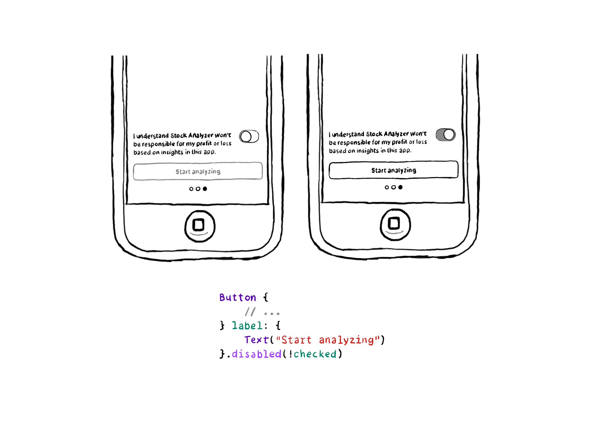
In SwiftUI you won't find the .notEnabled accessibility trait. Instead, you can just configure a view as such with .disabled(true), and pass false to enable it. VoiceOver will announce it as "dimmed". https://developer.apple.com/documentation/swiftui/view/disabled(_:)
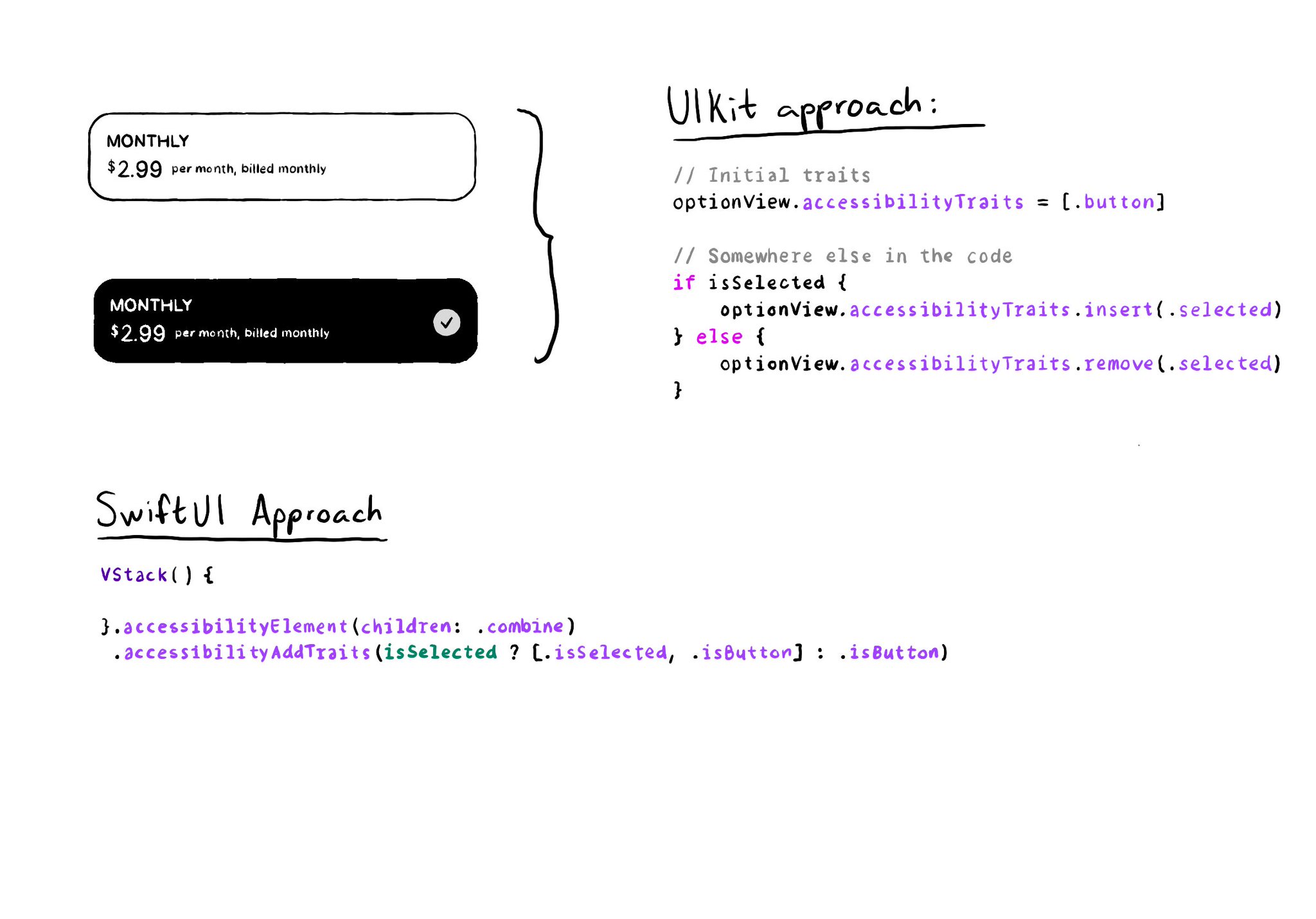
As with UIKit, in SwiftUI you can also add/remove a11y traits. But because of its declarative nature, you'll have to approach it in a slightly different way. A little nuance, but something that made me scratch my UIKit head when learning SwitUI.
The equivalent of using a .semanticGroup accessibilityContainerType in UIKit, would be to use the .accessibilityElement(children: ) modifier with the .contain option in SwiftUI. Here's a refresher with some use-cases: https://x.com/dadederk/status/1558790851496742914
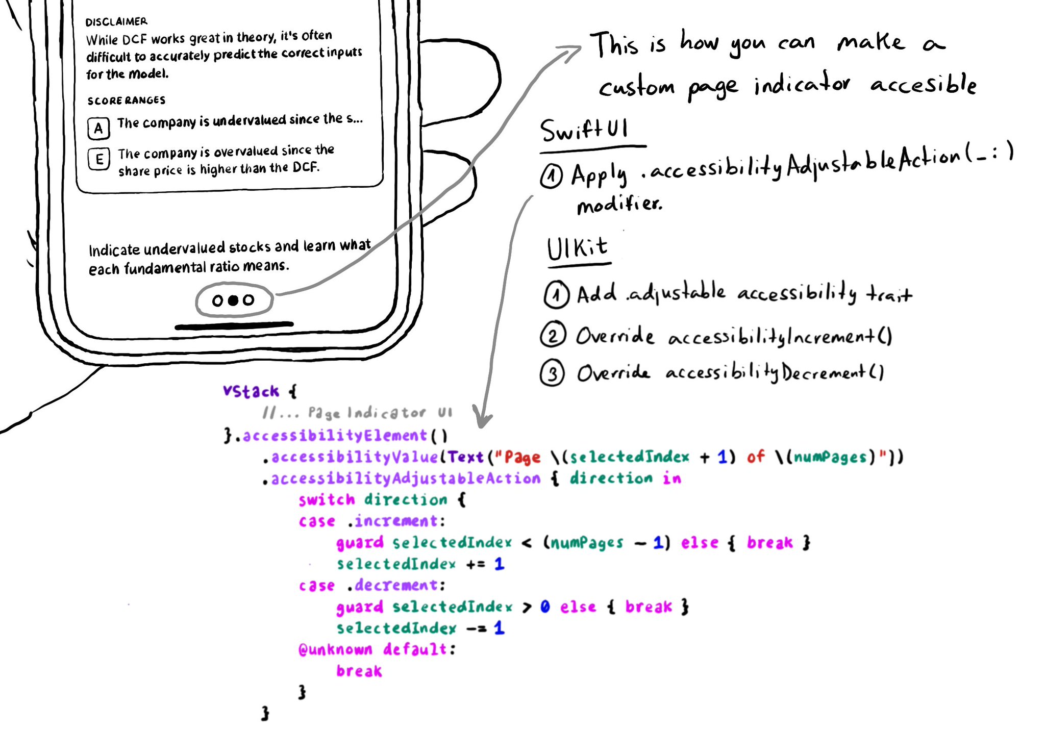
In UIKit, to create an adjustable component we need to add the adjustable trait and override both accessibilityIncrement() and accessibilityDecrement(). In SwiftUI, everything you need is bundled in the accessibilityAdjustableAction(_:) modifier.
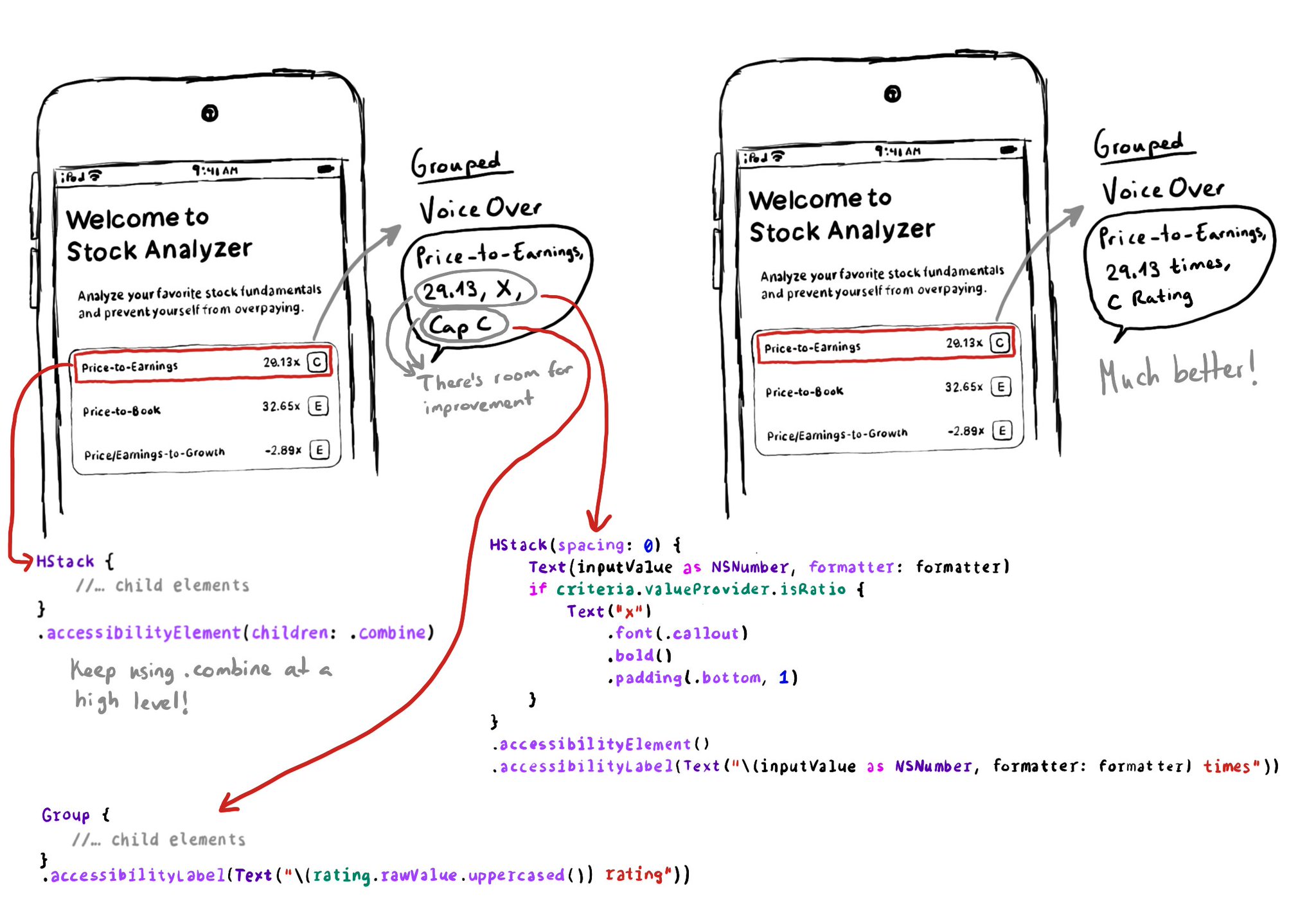
Grouping elements with .accessibility(children: .combine) doesn't always generate the best accessibility label. Comma-separating labels might sometimes not be ideal. But you can improve it by tweaking the labels/grouping of its children first.
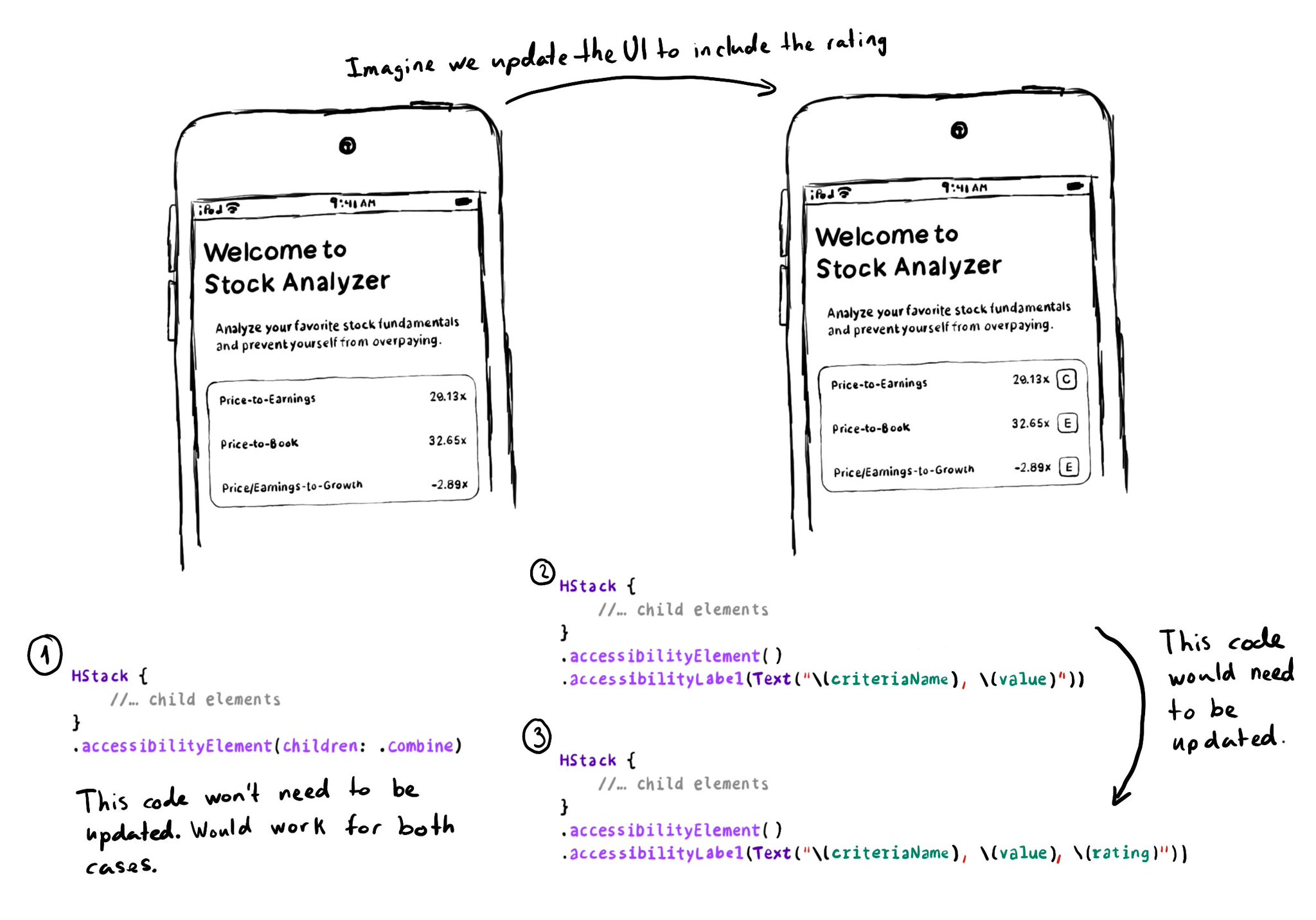
Apple asks us to consider the combine behavior, before using ignore, for .accessibilityElement(children: ). And for good reason, if combine works, and later on you decide to change the UI, the accessibility attributes will be updated for you.
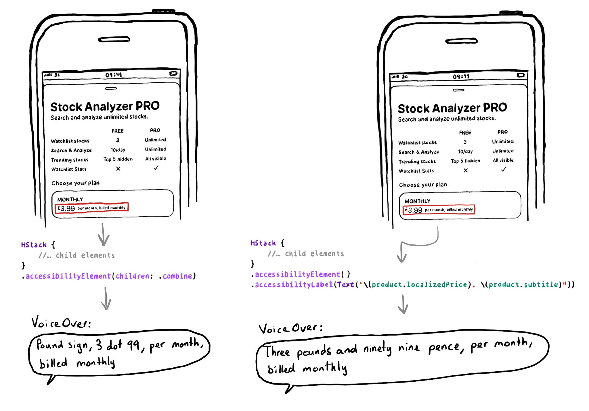
The .accessibilityElement(children: ) modifier with the .ignore argument does a similar thing to set the container view to be an accessibility element in UIKit. It is the default argument, so you can just say .accessibilityElement(). Because of this, you'll need to use other modifiers to make it accessible and manually configure an accessibility label and value, traits... when necessary. https://developer.apple.com/documentation/swiftui/view/accessibilityelement(children:) https://developer.apple.com/documentation/swiftui/accessibilitychildbehavior/ignore
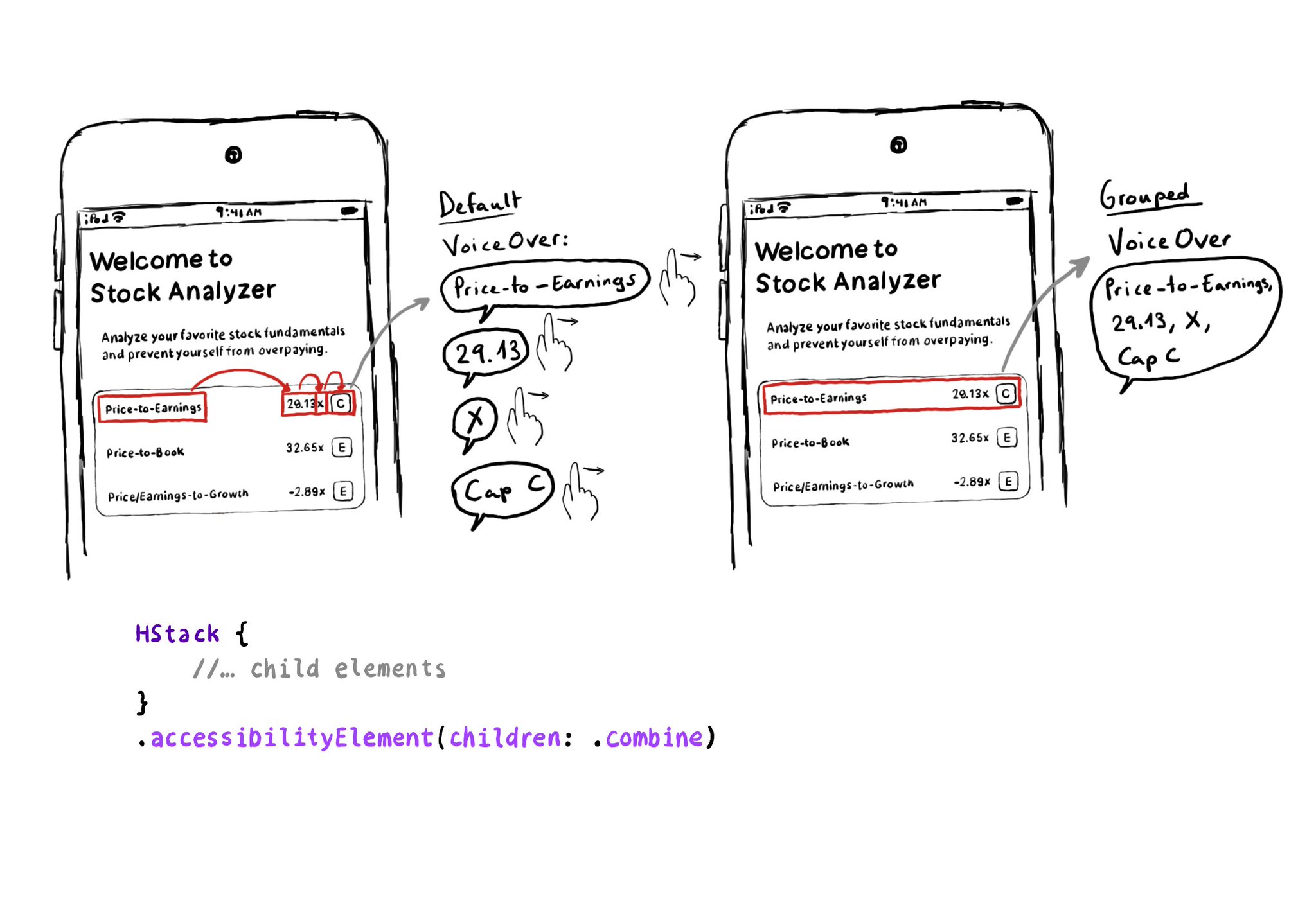
Grouping elements in SwiftUI is extremely easy! You can use the .accessibility(children: .combine) modifier. And that's it! It merges properties. For example, generating an accessibility label by joining the children's ones, separated by commas.
If you want to know everything about how to "Tailor the VoiceOver experience in your data-rich apps" with the Accessibility Custom Content API, there is a WWDC21 session. https://developer.apple.com/videos/play/wwdc2021/10121/ When implementing accessibilityCustomContent, for any supplementary information, it returns an array that VoiceOver will announce in that given order. The value of the AXCustomContent first, then the label. Users can configure in VoiceOver's verbosity settings if it should say that there's more content available, or play a sound hinting that there is, or simply do nothing. So it should really be optional content as users might miss it.
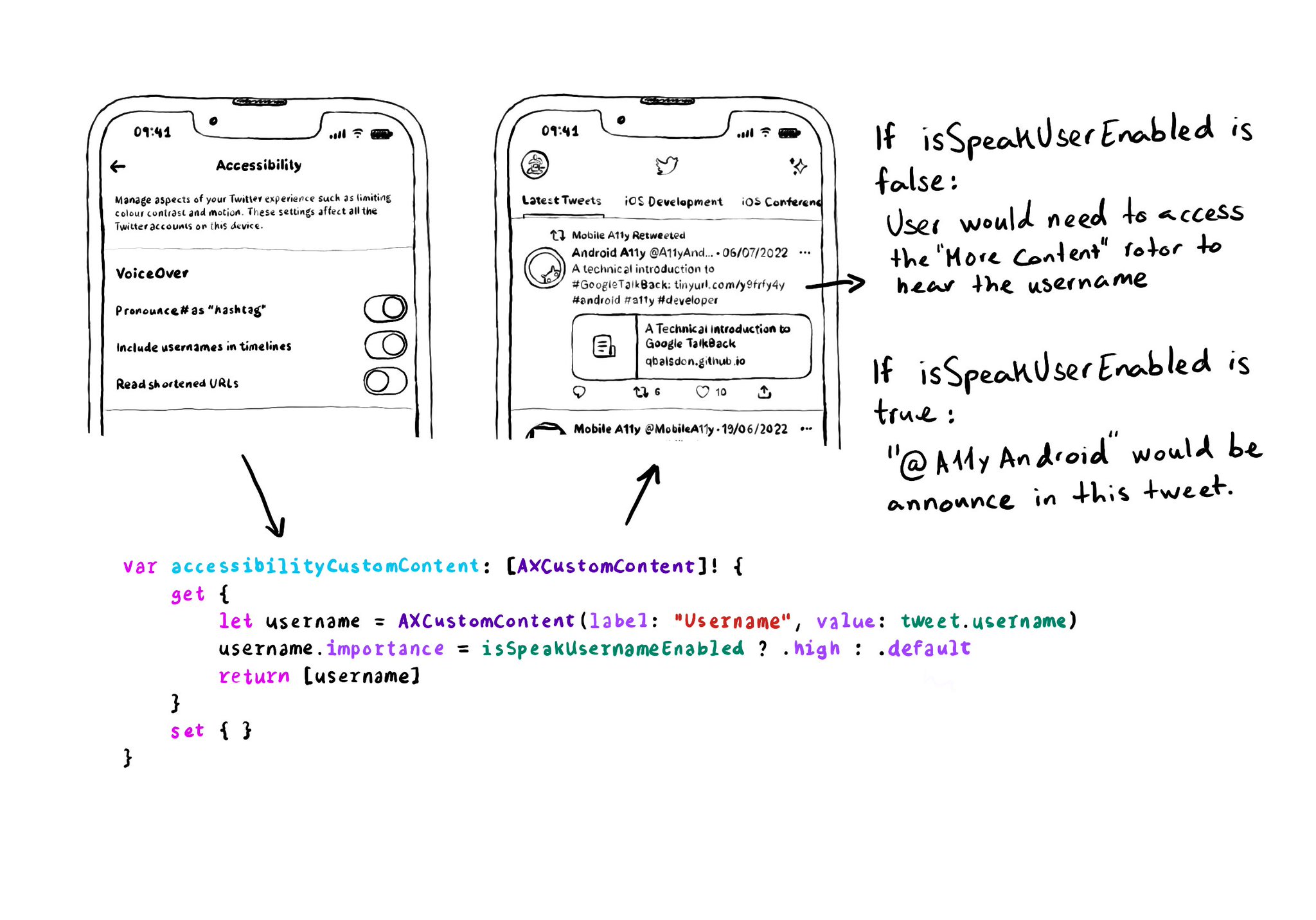
When creating AXCustomContent objects for accessibilityCustomContent, you can specify the importance of the data. If it is high, it will always be presented by VoiceOver. You could potentially ask the user if that data is of importance to them.
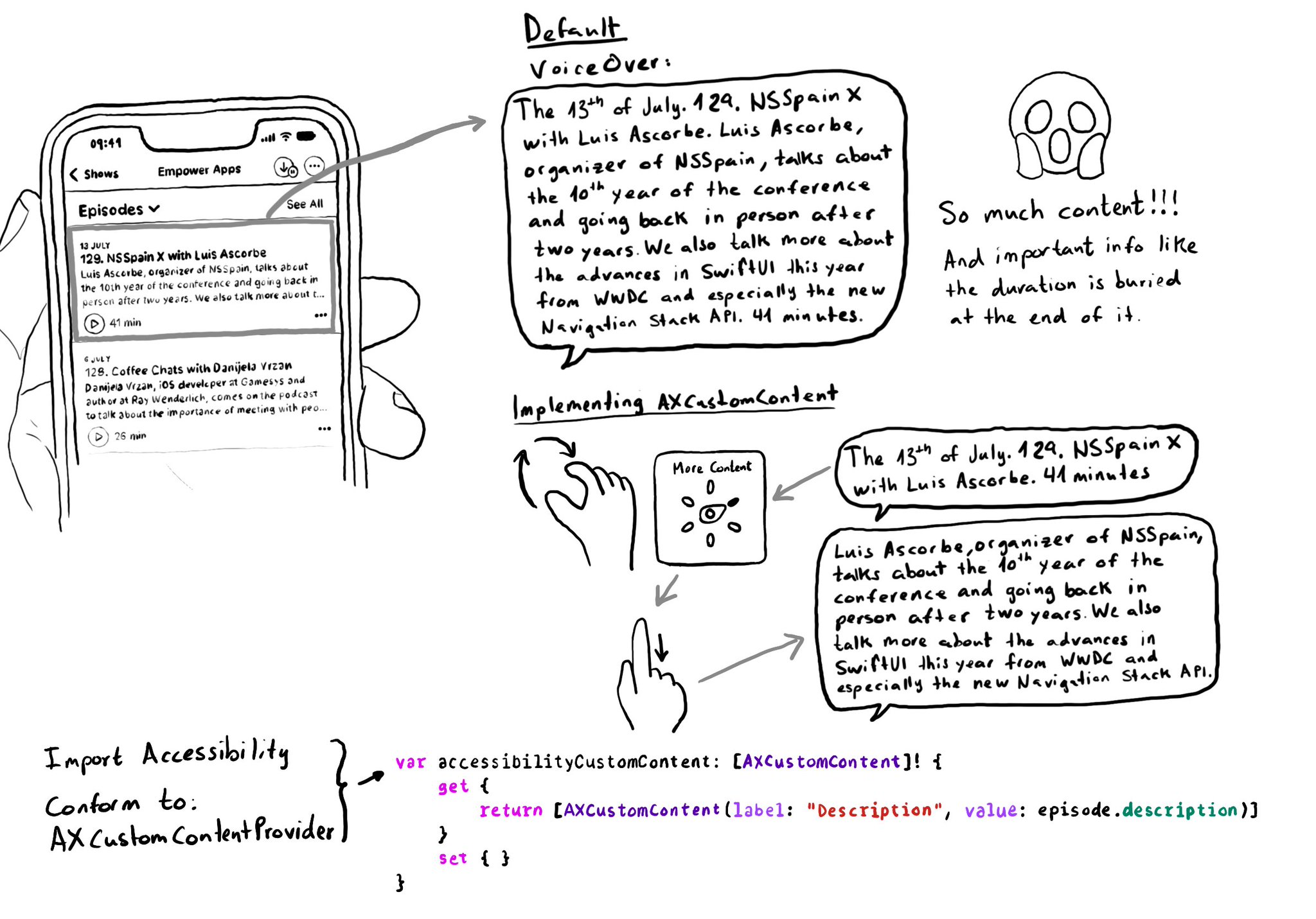
Too much data can overwhelm users. Very little is an incomplete experience. It is hard to find a balance on verbosity and the users may have different preferences. To help with this issue, the AXCustomContent APIs let you mark data as optional.
When making charts accessible, sometimes you may have just too many data points for the user to have to go one by one through all of them. In those cases, you can create accessibility elements that represent meaningful chunks of the graph.
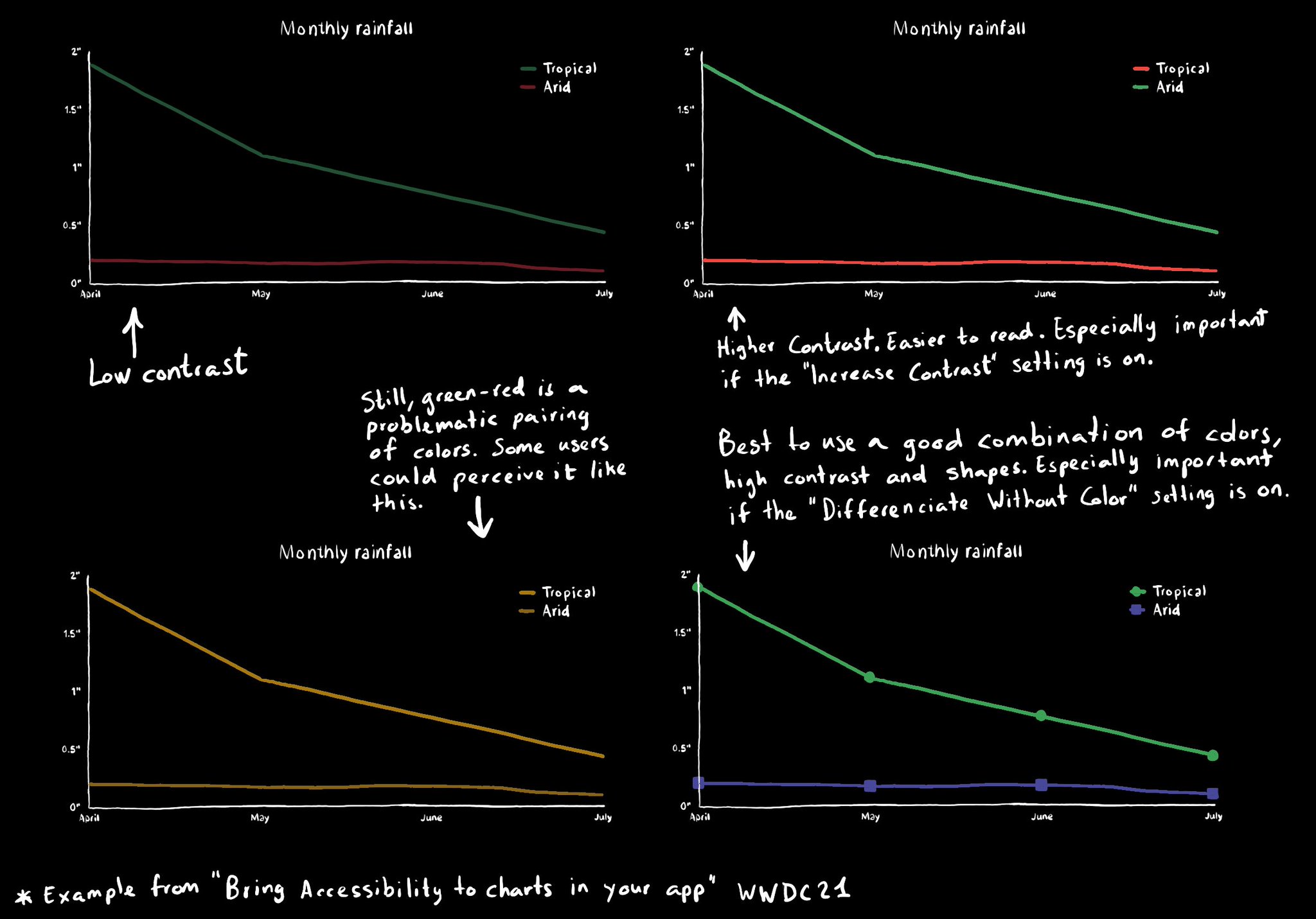
Some good practices when it comes to charts and data visualizations: use high contrast colors, avoid problematic pairings (red-green, blue-yellow), use symbols as well as colors...
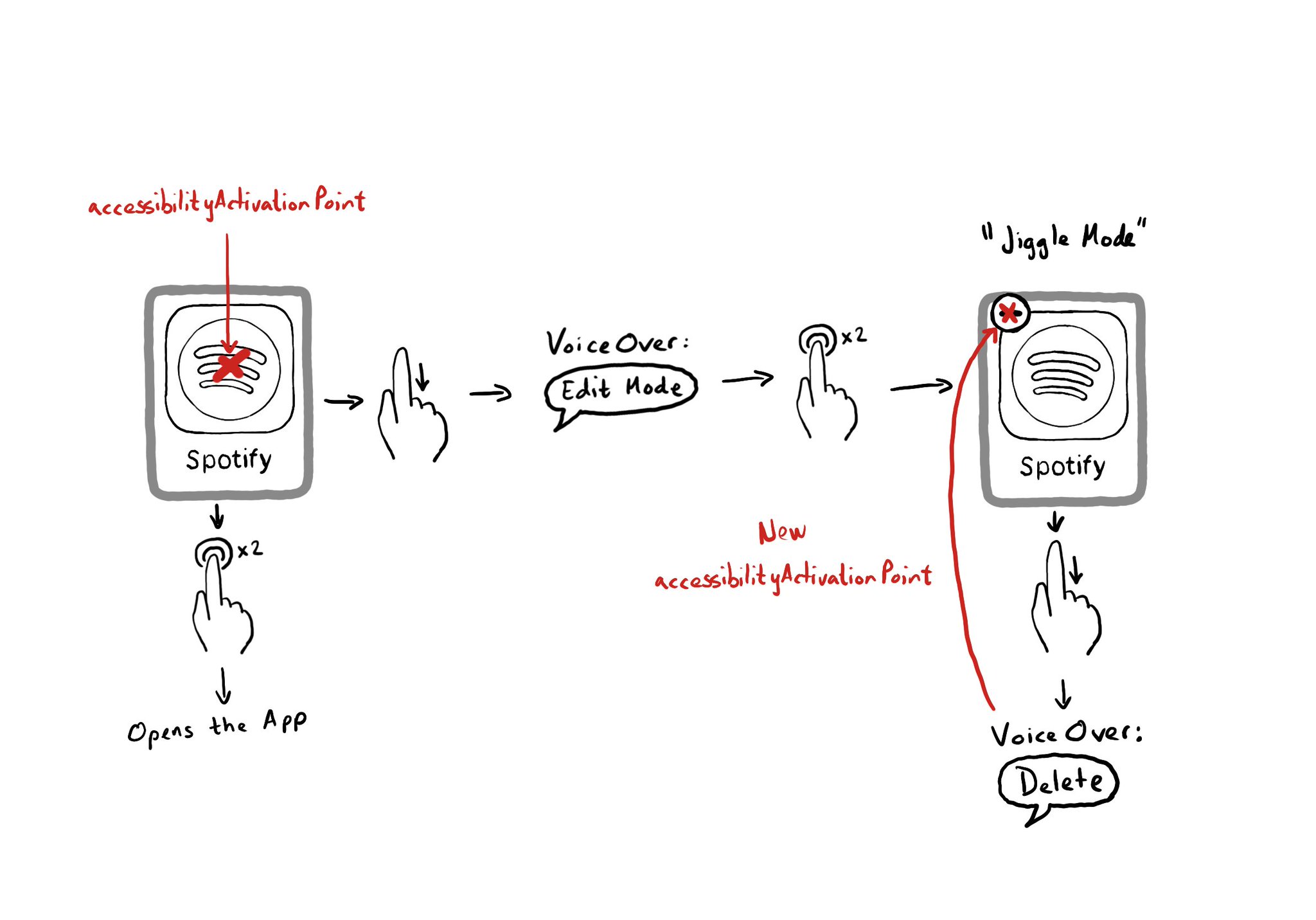
When something is focused with VoiceOver, if you double tap on the screen, it will be like interacting with the centre of the focused element. If you need to change that, you can customise the accessibilityActivationPoint. https://developer.apple.com/documentation/objectivec/nsobject-swift.class/accessibilityactivationpoint
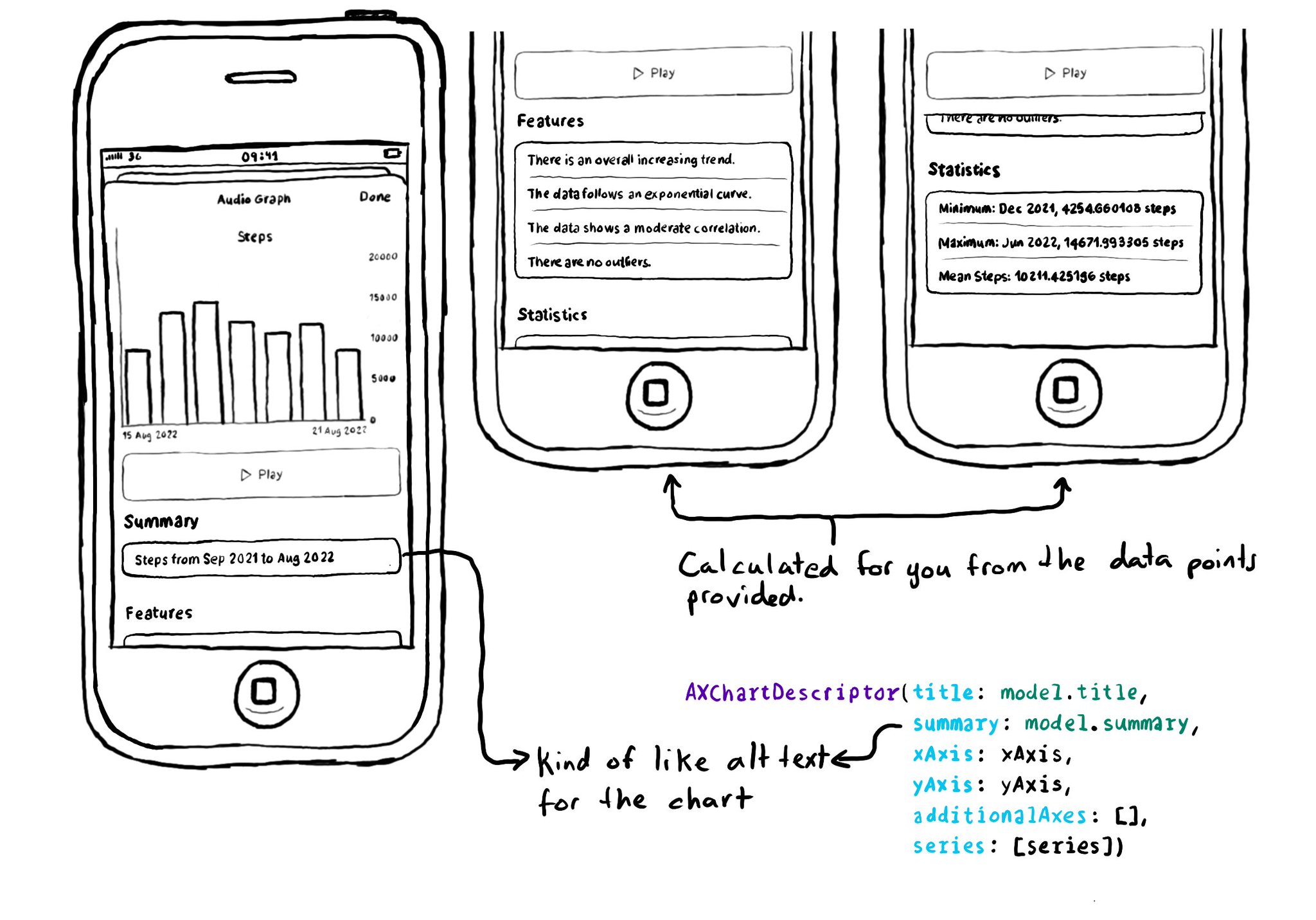
The Audio Graphs API has some very nice features aside from being able to consume the graph as audio. You can give it a summary and it will also provide your users with trends, correlations, outliers... and statistics like min and max or the mean.
Showing 121-135 of 230 posts