Tips and tricks to build accessible iOS apps
#365DaysIOSAccessibility
A year-long journey exploring iOS accessibility, one day at a time. Each post shares practical insights, tips, and techniques to make your iOS apps more accessible.
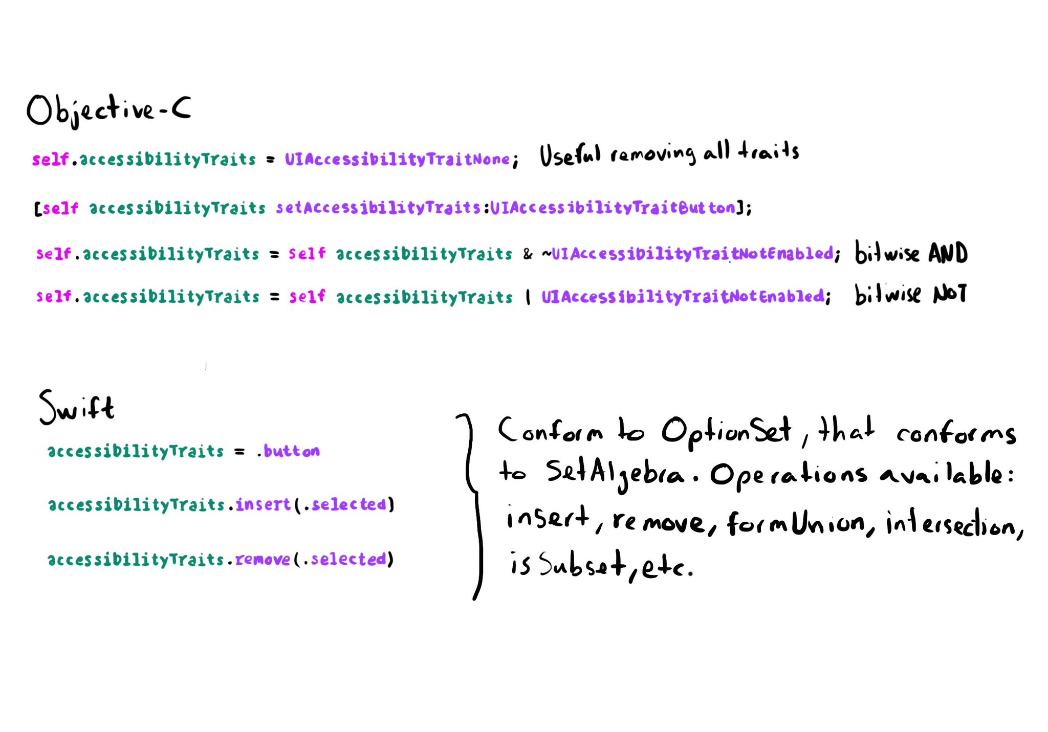
In Objective-C accessibility traits are a bitmask. Some devs find tricky to work with them using bitwise operations. In Swift they conform to the OptionSet protocol that conforms to SetAlgebra. That means you can simply insert/remove traits.
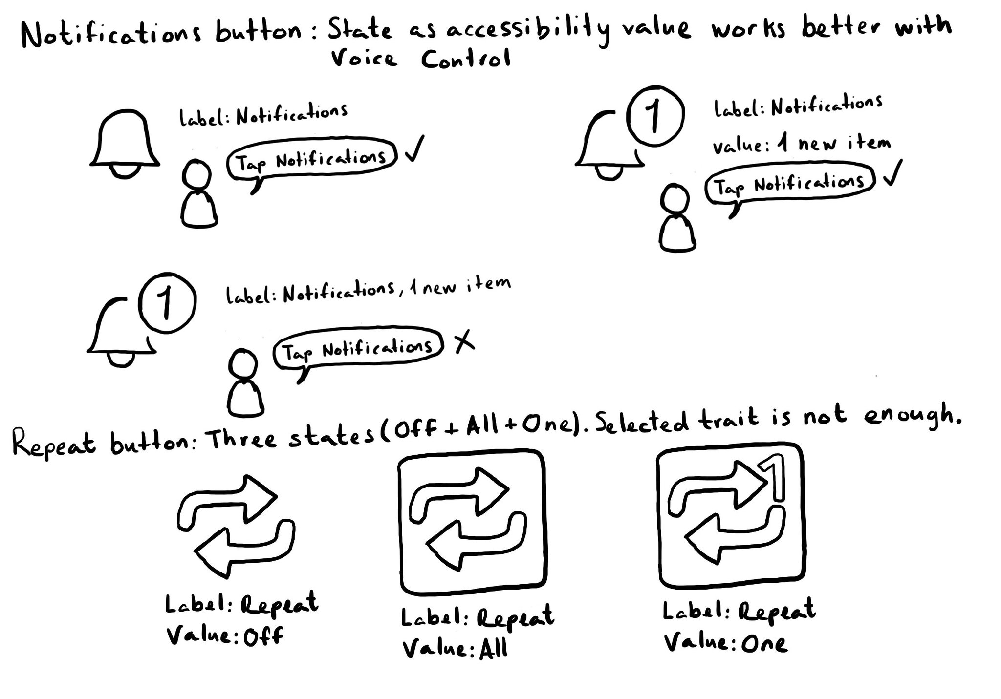
Accessibility values are about state. Using them appropriately will make the experience better for Voice Control users. Think of a repeat button (values could be: off, one or all songs) or a notifications tab (value could be: x new items). For more on accessibility values, check out this fantastic blog post from @MobileA11y with info on the APIs (UIKit, SwiftUI), accessibility attributed values, WCAG, or some more examples (text in a text field, value on a stepper or slider). https://mobilea11y.com/blog/accessibility-values/
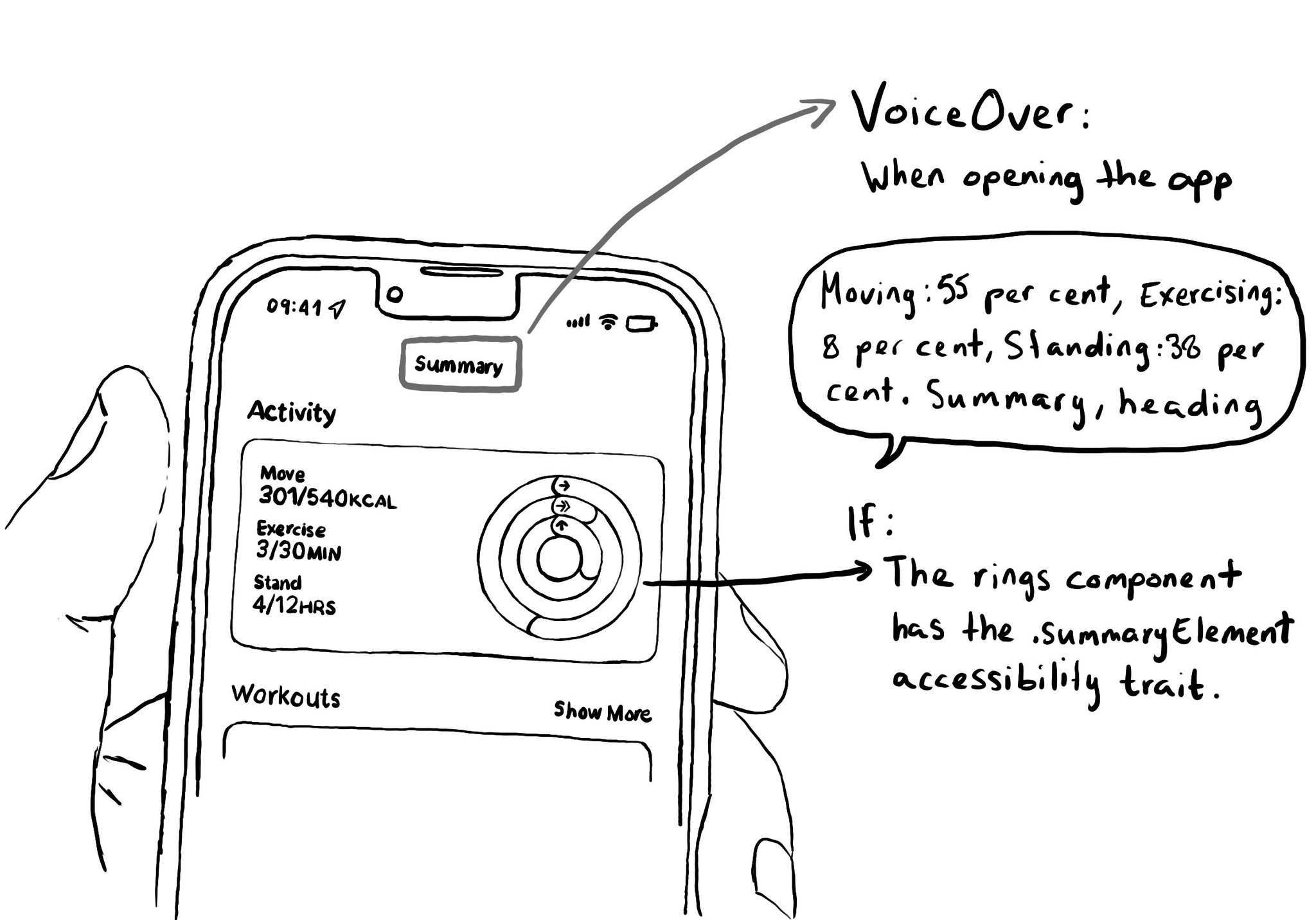
The .summaryElement accessibility trait causes VoiceOver to announce that element when the app starts. The element won't get the focus though, and the order is not affected. A candidate for this trait could be the rings info in the Activity app.
There is another accessibility trait: .playsSound, that does a similar thing than .startsMediaSession. This one seems more suitable for buttons that have their own sound effects when interacting with them, like it often happens in games.
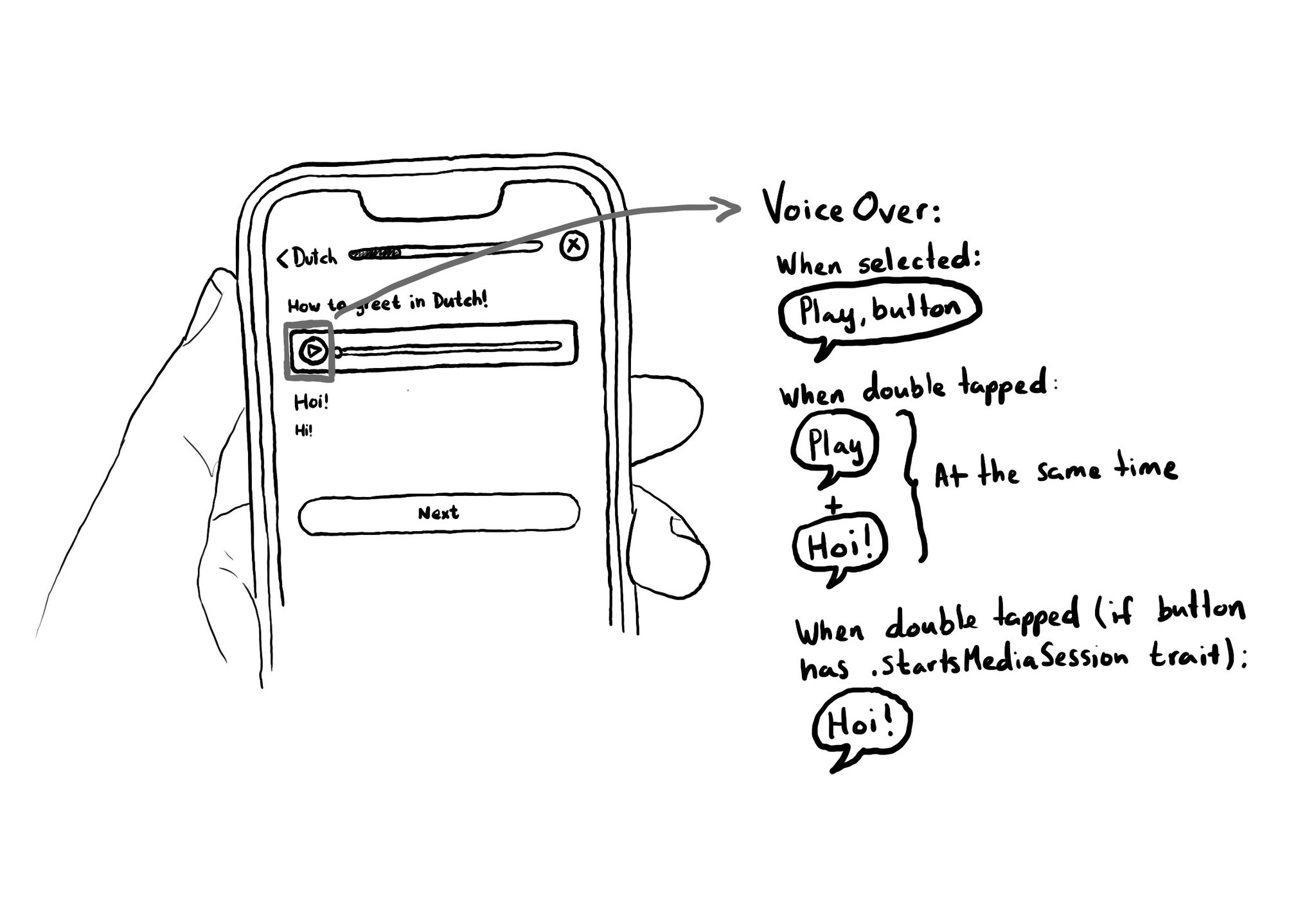
When interacting with a button with VoiceOver, the accessibility label is repeated to the user. If you are playing some audio, it could be difficult to listen to it properly. To avoid that, you can add the .startsMediaSession accessibility trait.
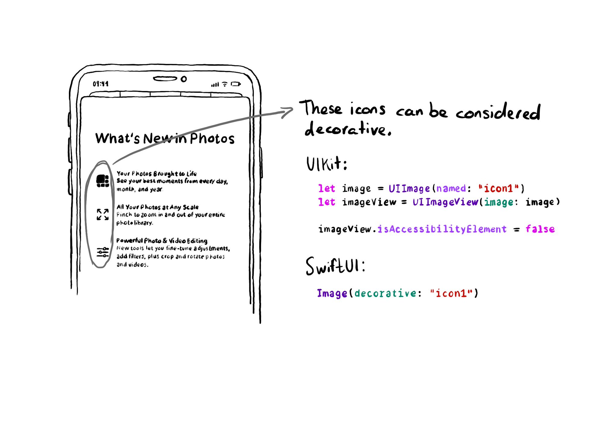
If an image does not convey additional information, maybe it's just used to make the UI look more attractive, it makes sense for VoiceOver to skip it. UIKit: set isAccessibilityElement to false. SwiftUI: create a decorative image explicitly.
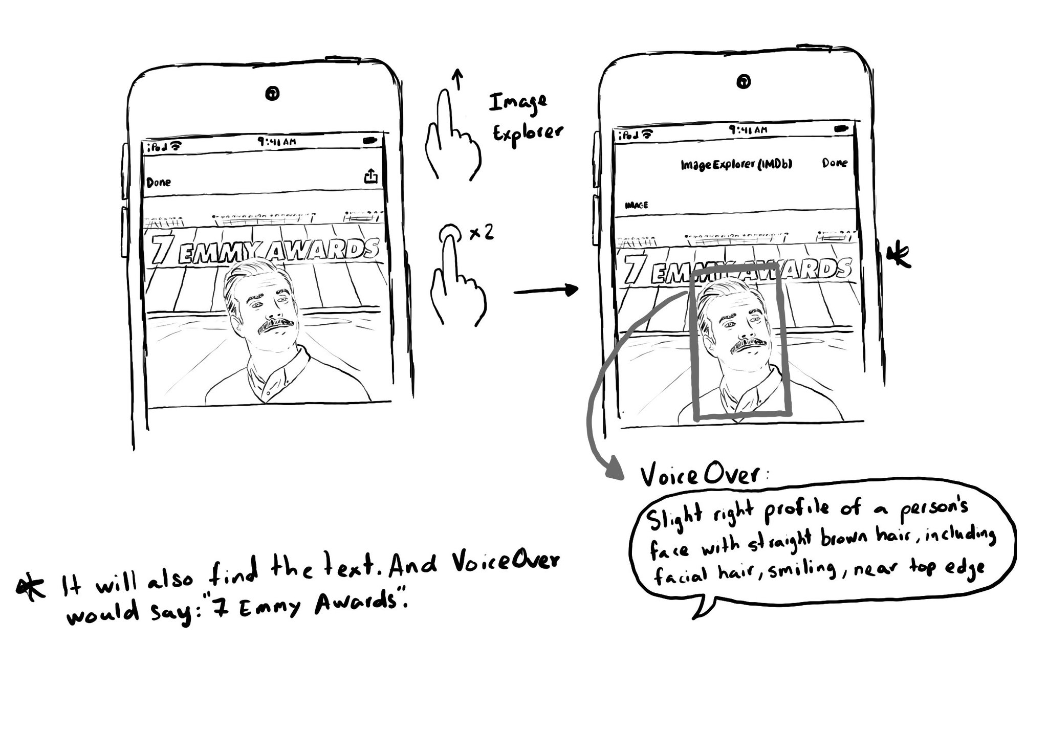
Images that convey important information should have the .image accessibility trait and provide an alternative text in the accessibility label. "Image" will be added to VoiceOver's utterance and the user will be able to use Image Explorer. Image Explorer is fairly new, introduced just a couple years ago. But if you were appropriately configuring the image trait, users suddenly got this new functionality for free. Isn't that awesome? With VoiceOver on, open Image Explorer by swiping up in an image and double tapping. It lets users find people (with a basic description and positioning in the photo), objects or text in images, using on-device intelligence. It is very cool!
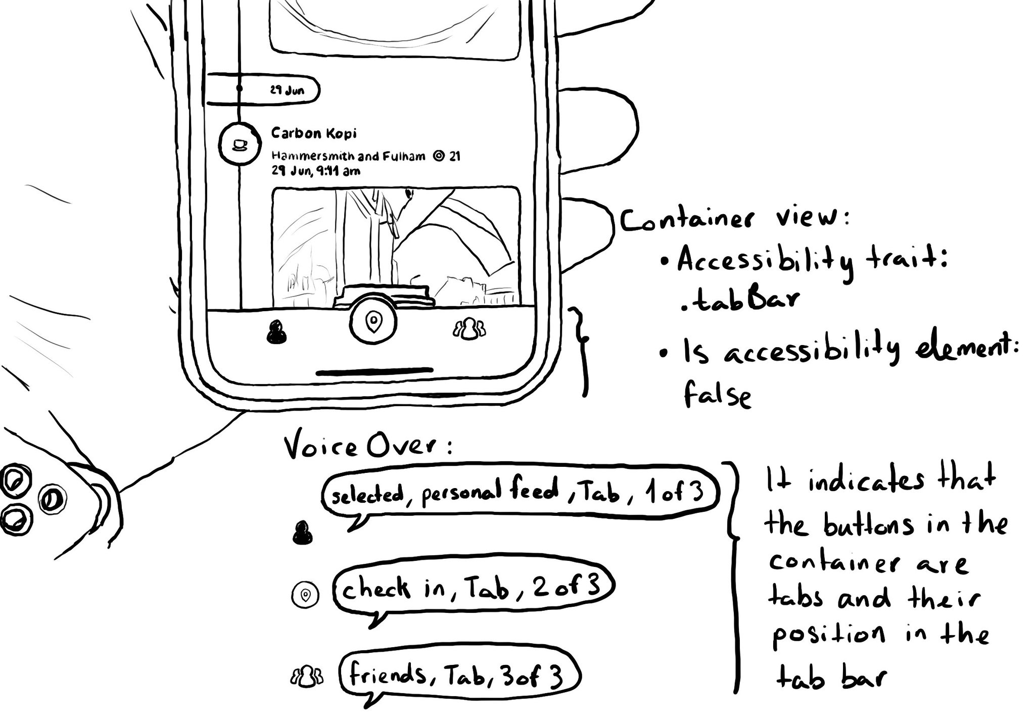
I'll never recommend creating a custom component if there is a native one that does the job. But if you develop a custom tab bar, .tabBar accessibility trait comes to the rescue. Apply to a container view and its buttons will be announced as tabs.
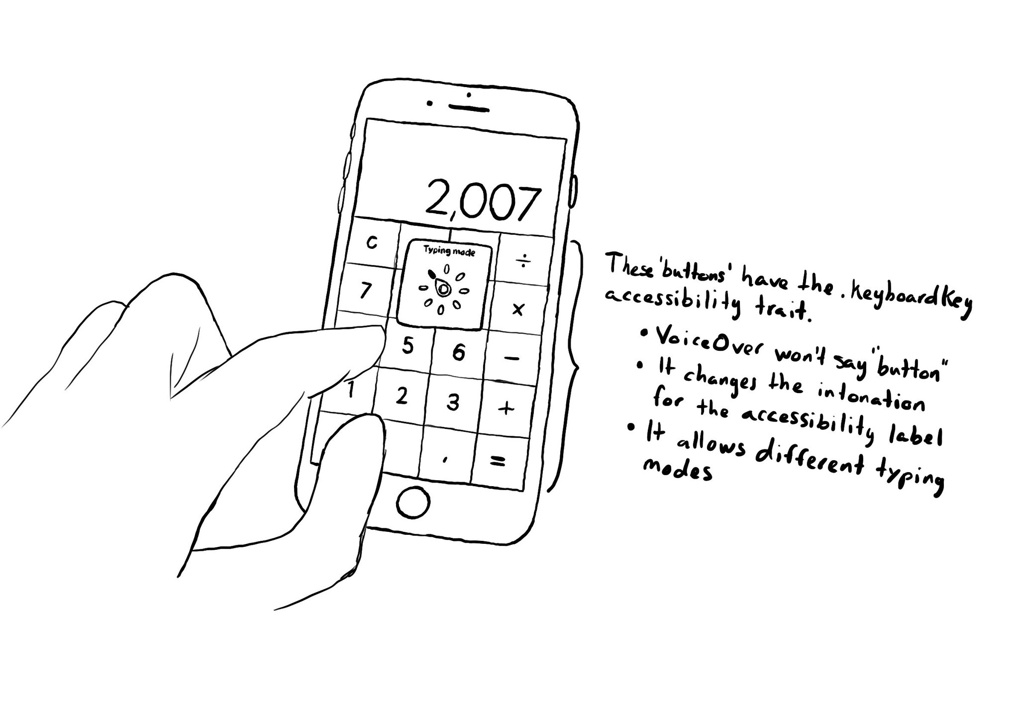
There is an accessibility trait for defining something that represents a custom keyboard's key: .keyboardKey. It allows VoiceOver users to change the typing mode to Direct touch typing. The calculator app or an access pin pad, are some examples.
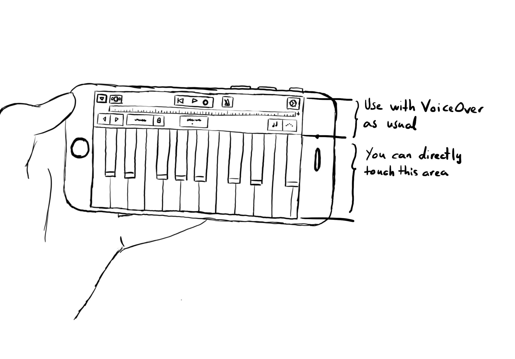
Imagine playing a piano with VoiceOver. You'd have to find the key you want to play and then double tap. It would be a very difficult experience. With the .allowsDirectInteraction accessibility trait, VoiceOver passes through touch gestures. Use carefully! And only when it really makes sense to be able to handle controls directly with touch. Other examples could be a drawing app or some games.
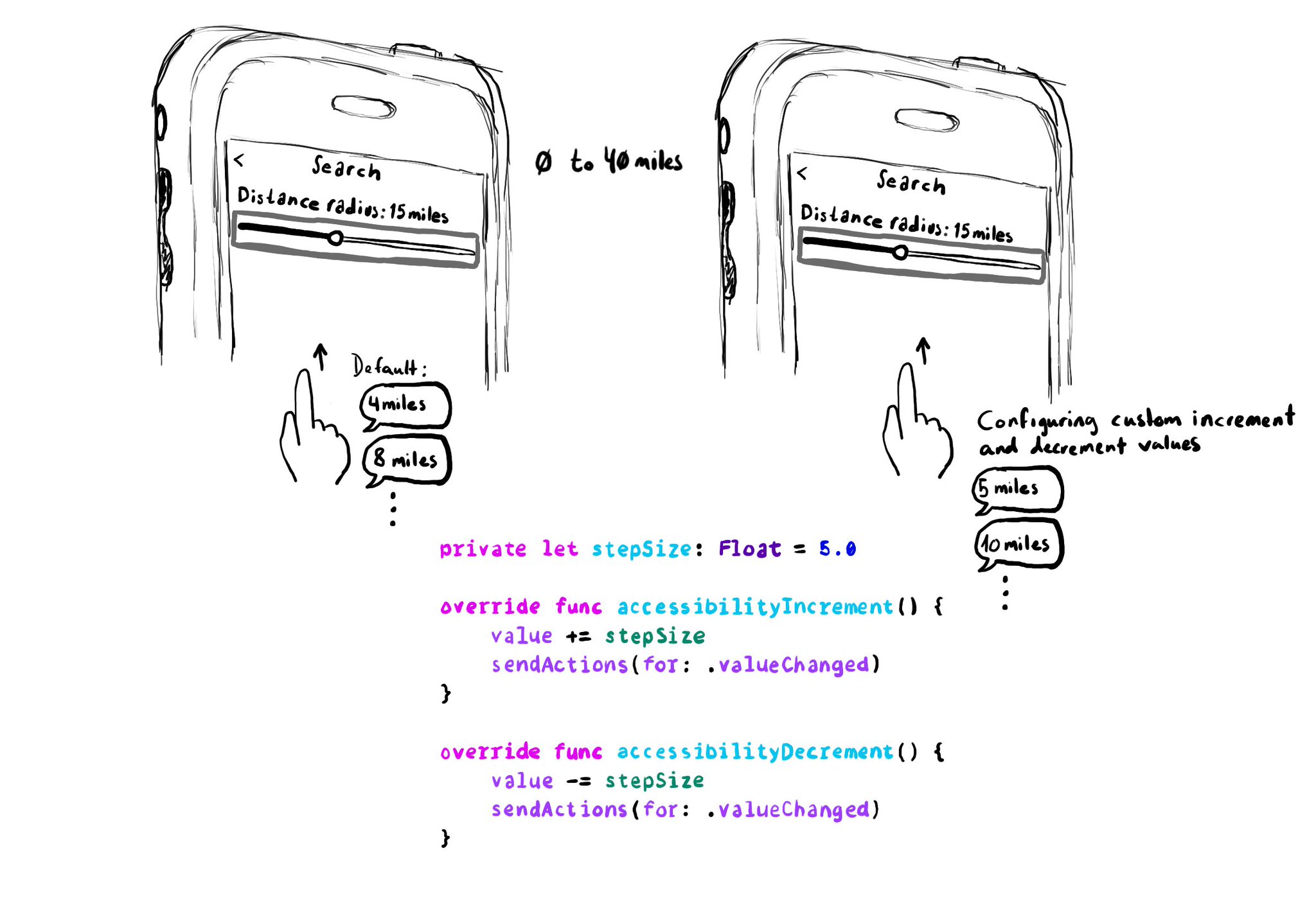
When implementing a UISlider, it is a good idea to consider how much the slider value should change when swiping up/down to adjust it. It might not always make sense to do it in 10% increments, which is the default behaviour. Could be because the value at those intervals doesn't make sense, or feel random, or because it wouldn't provide the user with a fine enough control being able to go through the whole slider in just 10 swipes. It user will still be able to adjust the slider to any value by double tapping and holding and then moving the finger left or right, bypassing VoiceOver gestures. VoiceOver announces the new value as it changes.
Do you know when a UI element is greyed out to show that it is disabled? Yes, there is an accessibility trait for that too: .notEnabled. VoiceOver will say “dimmed” after its accessibility label and Voice Control and Switch Control will skip it.
The .selected accessibility trait indicates when an element has been selected. You’ll notice that VoiceOver announces “selected” before the accessibility label. You can find that in the system for the selected tab in the tab bar, for example.
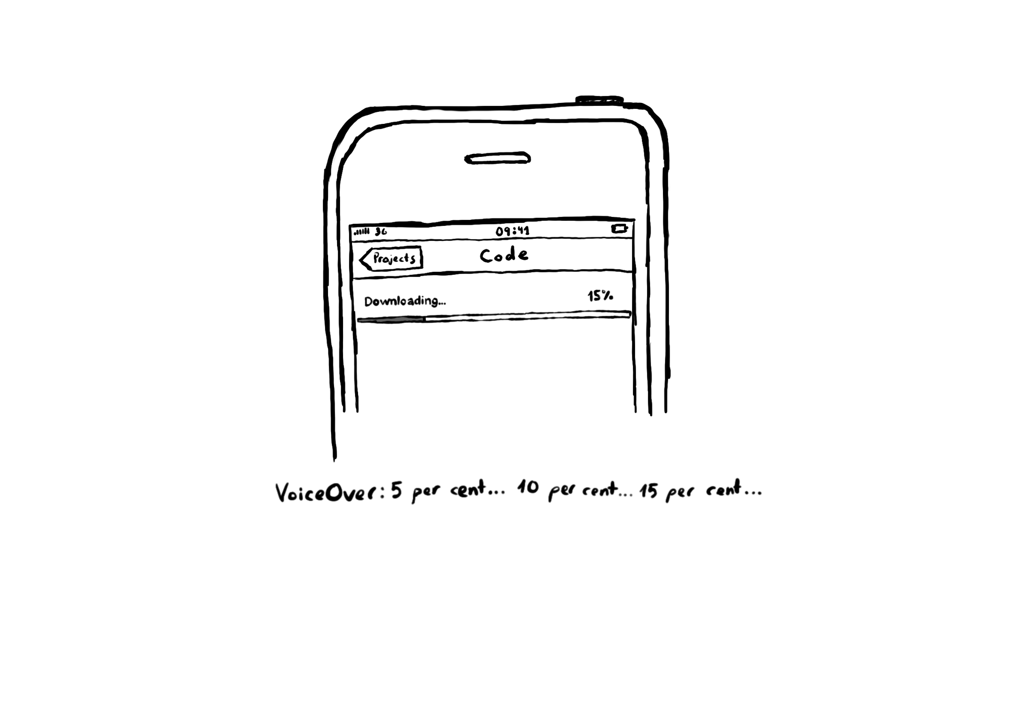
If you want to update the VoiceOver user frequently about how a component is changing, when focused, you can use the .updatesFrequently accessibility trait. A downloading progress bar, a stock value, or a timer, are some examples.
Styling a search bar is hard. Lots of developers opt to build their own instead. If you do, remember to add the .searchField accessibility trait. VoiceOver will announce "Search Field" indicating the user that results might change as they type.
Showing 181-195 of 230 posts