Tips and tricks to build accessible iOS apps
#365DaysIOSAccessibility
A year-long journey exploring iOS accessibility, one day at a time. Each post shares practical insights, tips, and techniques to make your iOS apps more accessible.
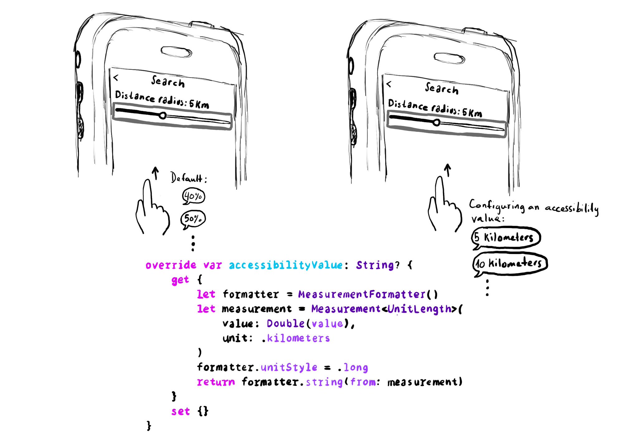
UISliders are adjustable, and its default accessibility value is represented in percentages. But that's not always the best format to express a value. Consider a slider to select a distance radius. Miles or km seem a more appropriate unit.
Example code in the image:
```swift
override var accessibilityValue: String? {
get {
let formatter = MeasurementFormatter()
let measurement = Measurement
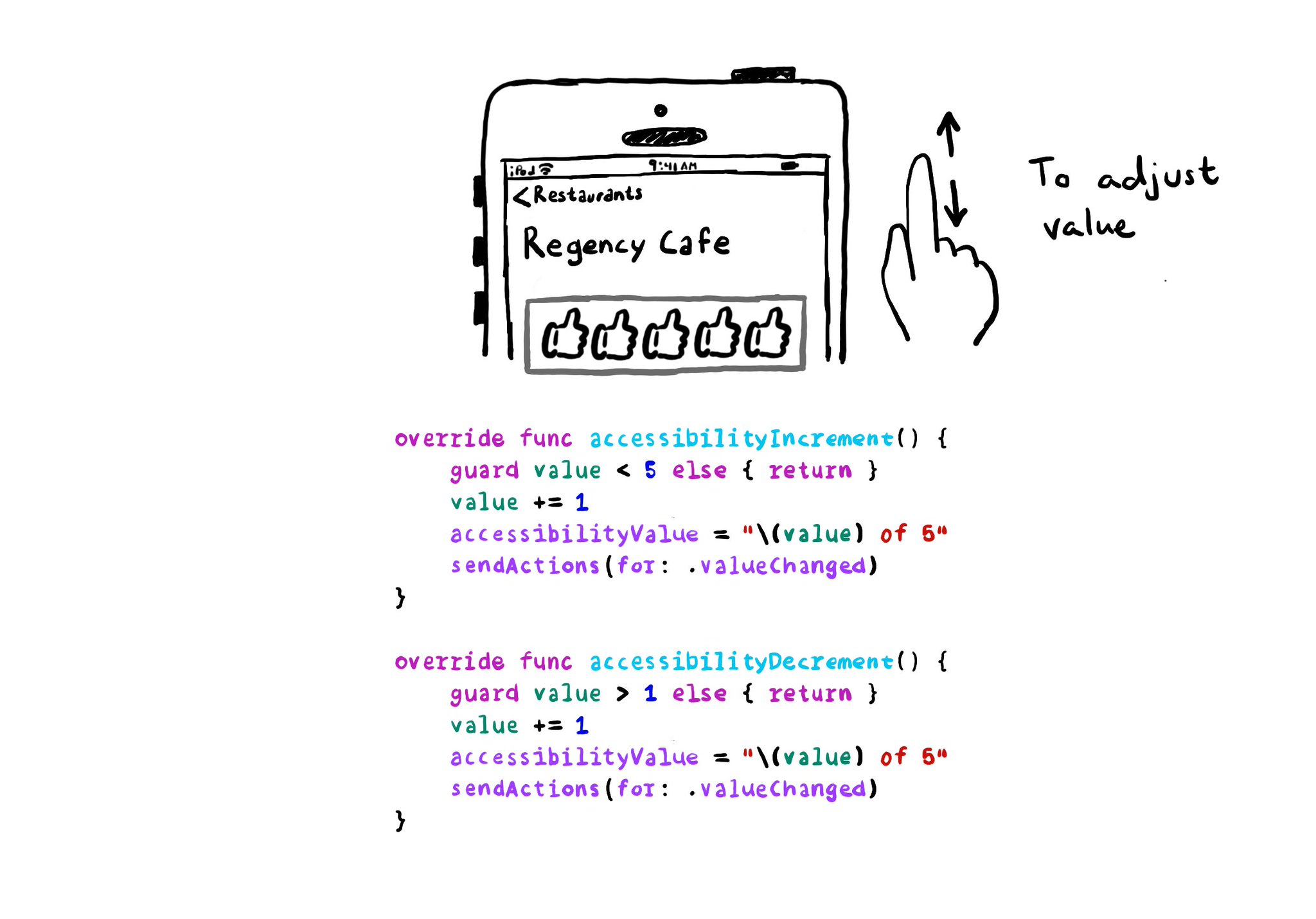
With VoiceOver, you can swipe up/down to increase/decrease the value of adjustable components. You need to implement accessibilityIncrement() and accessibilityDecrement() accordingly, and configure an accessibility value that makes sense. Example code in the image: ```swift override func accessibilityIncrement() { guard value < 5 else { return } value += 1 accessibilityValue = "\(value) of 5" sendActions(for: .valueChanged) } override func accessibilityDecrement() { guard value > 1 else { return } value -= 1 accessibilityValue = "\(value) of 5" sendActions(for: .valueChanged) } ``` Links to the official documentation: * accessibilityincrement() * accessibilitydecrement()
If you are developing a custom component, that can change value, chances are that it will need the adjustable accessibility trait (VoiceOver will say: "Adjustable"). Think of a component that lets you rate from one to five thumbs up (or stars).
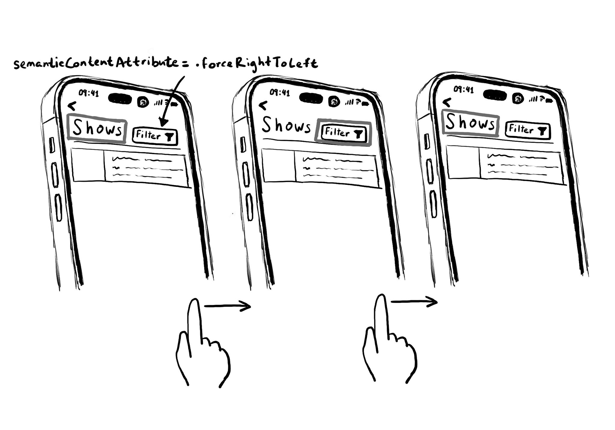
Hacks are accessibility’s worst enemy. An example. There is a ‘trick’ floating on the internet: if you want a button with an icon to the right of the text, set the semantic content attribute to force right to left. Great way to create focus traps.
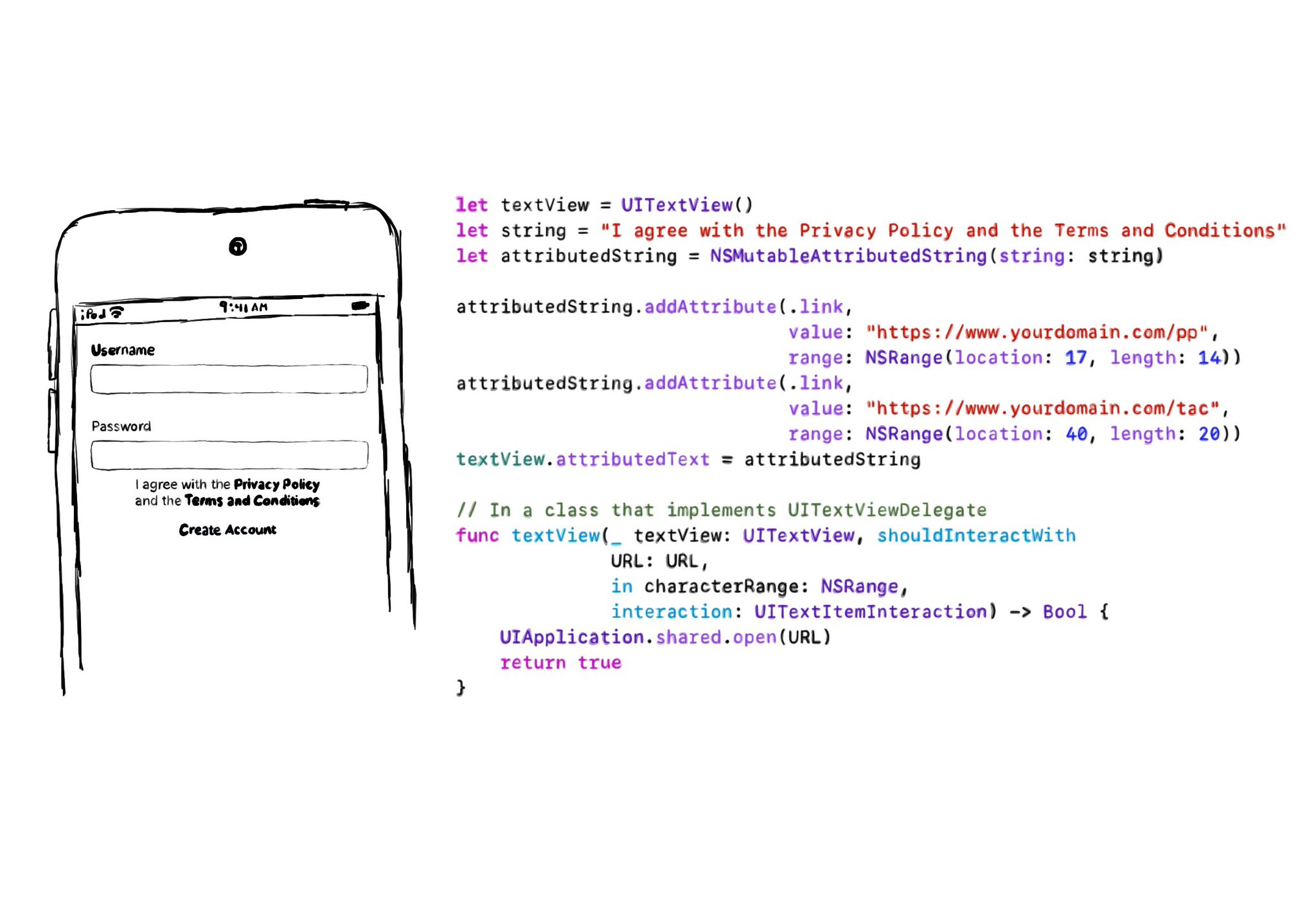
If you need multiple links embedded in some text (like the classic T&Cs and Privacy policy), the easiest is to use a UITextView & Attributed Strings, and it will work beautifully with VoiceOver. You'll be even able to navigate through links. In the example, VoiceOver would say: “I agree with the Privacy Policy and the Terms and Conditions, link”. Swipe down, should announce: “Privacy Policy, link” and you can double tap to open it. Swiping down one more time announces: “Terms and Conditions, link”. Example code in the image: ```swift let textView = UITextView() let string = "I agree with the Privacy Policy and the Terms and Conditions" let attributedString = NSMutableAttributedString(string: string) attributedString.addAttribute(.link, value: "https://www.yourdomain.com/pp", range: NSRange(location: 17, length: 14)) attributedString.addAttribute(.link, value: "https://www.yourdomain.com/tac", range: NSRange(location: 40, length: 20)) textView.attributedText = attributedString extension ViewController: UITextViewDelegate { func textView(_ textView: UITextView, shouldInteractWith URL: URL, in characterRange: NSRange, interaction: UITextItemInteraction) -> Bool { UIApplication.shared.open(URL) return true } } ```
The link accessibility trait is applied to UI elements that open some web content. It usually appears in-line in the content and represented by underlined text, but not always. VoiceOver will say "link" after the accessibility label.
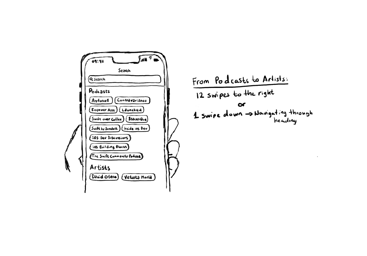
Configuring the header accessibility trait, when appropriate, is one of my favourite accessibility quick wins. In this example, you need a single swipe down, instead of 12 swipes to the right to get to from Podcasts to Artists, in the app.
The header accessibility trait makes VoiceOver announce something as a header. More importantly, it lets the user navigate through headings, swiping up/down, significantly speeding up navigation and making it easier to explore/discover content.
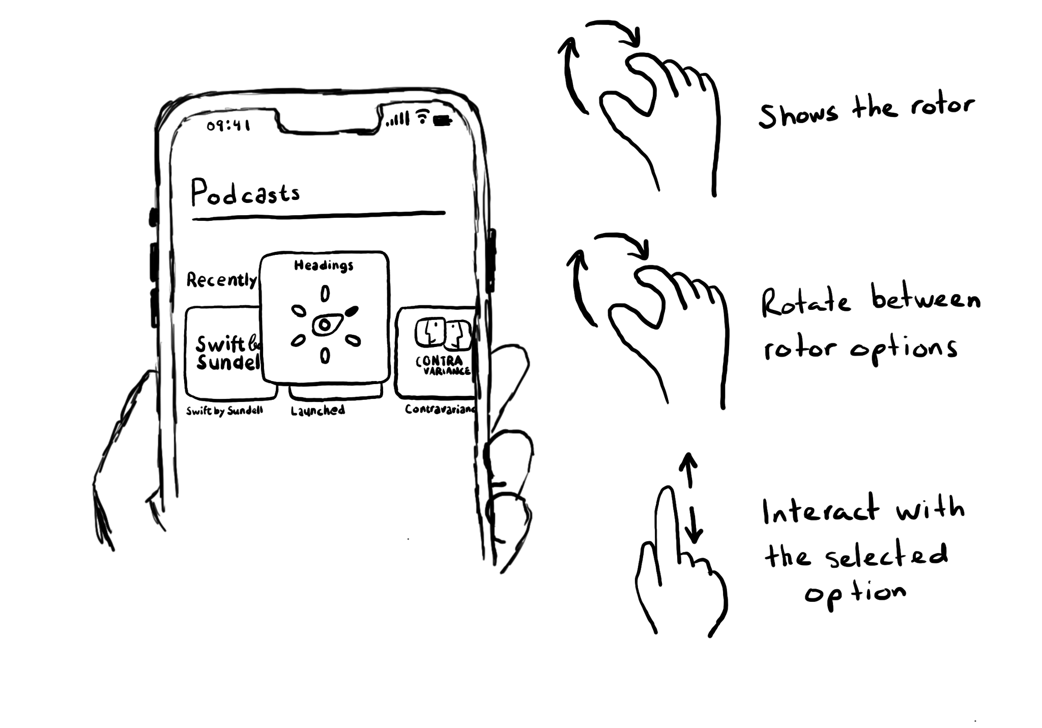
Meet the rotor. A menu that you activate (and change options) by rotating two fingers on the screen. It lets you select different navigation modes and customizations. Like navigating through headings or changing VoiceOver’s speaking rate.
If, for some reason, you are creating a button from scratch, instead of relying on UIButton (perhaps you are adding a fancy micro interaction animation?), take into account that you’ll need to configure the button accessibility trait.
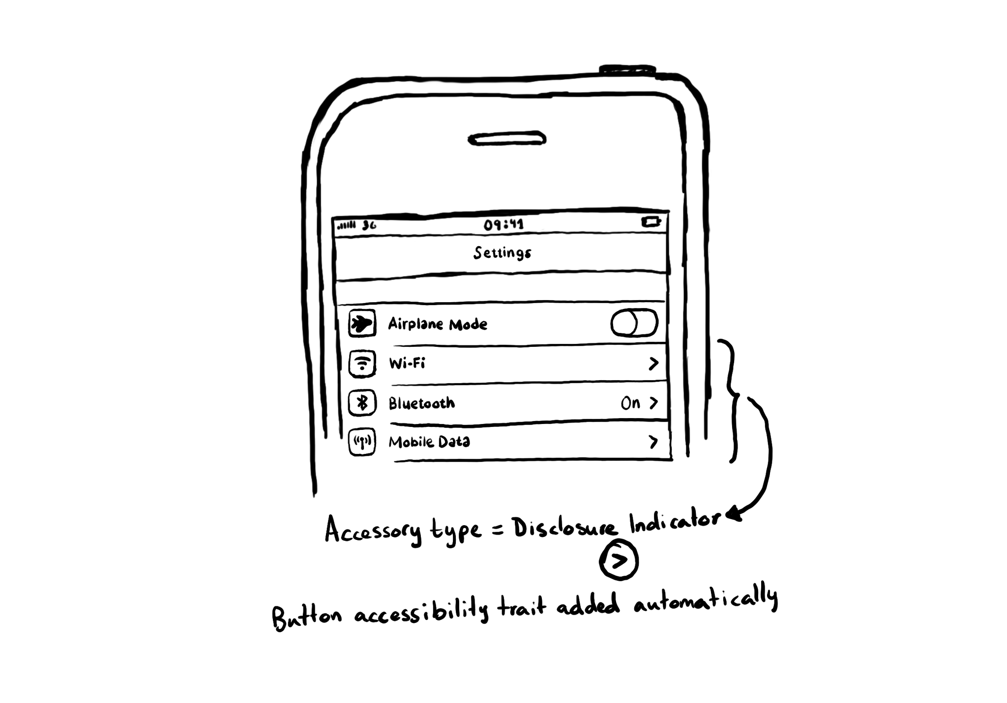
If a table view cell has a disclosure indicator accessory type configured, the button trait gets added automatically. A good reminder that when following Apple's Human Interface Guidelines, things are more accessible out of the box.
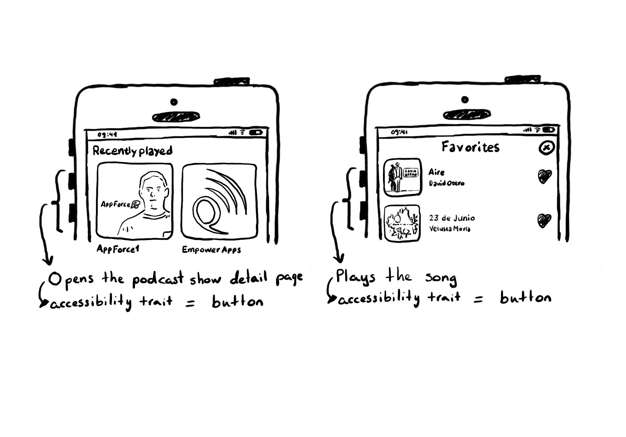
A common example where you need to manually configure the button accessibility trait is for some table/collection view cells. These tend to be “buttons” that perform an action, like playing music, or bring the user to a different screen.
With the button trait VoiceOver will read “button” after the accessibility label and will indicate the user that, when focused, they can double tap anywhere on the screen to interact with it. UIButton has this trait by default.
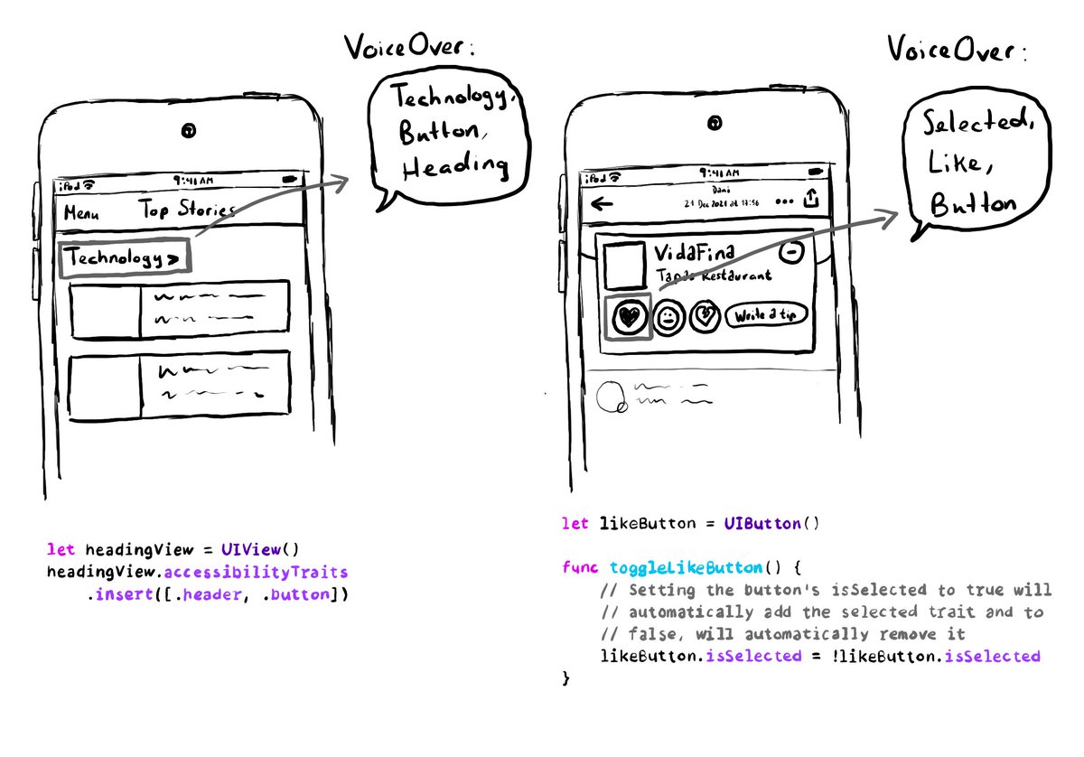
A component can have more than one accessibility trait, they can be combined. A heading can be a button too, for example. Or a button could be selected. You can insert or remove the selected trait to the button, when needed.
An accessibility trait is the role of the component. Among other things, it gives the user information on how they can interact (or not) with it. When using VoiceOver, the trait is usually (not always) read after the accessibility label. At the time of writing this tweet, there are 18 different accessibility traits: https://developer.apple.com/documentation/uikit/uiaccessibilitytraits Some examples are: button, header, selected, adjustable or not enabled.
Showing 196-210 of 230 posts