Tips and tricks to build accessible iOS apps
#365DaysIOSAccessibility
A year-long journey exploring iOS accessibility, one day at a time. Each post shares practical insights, tips, and techniques to make your iOS apps more accessible.
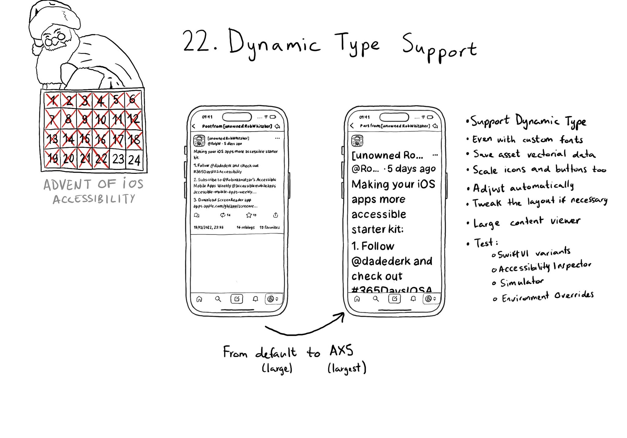
Make sure you support Dynamic Type up to the largest text size available. Take into account that there are five extra accessibility sizes available from the Accessibility Settings. It can make a huge difference for lots of users.
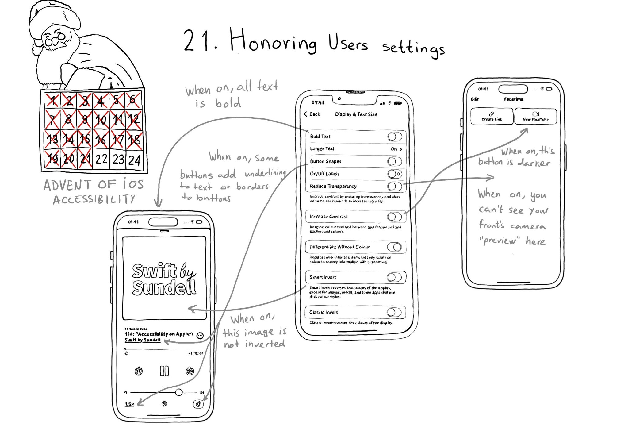
There are a few accessibility settings you can check for, or get notifications in case these preferences change. This is especially important when developing custom components as they will mostly work with UIKit controls.
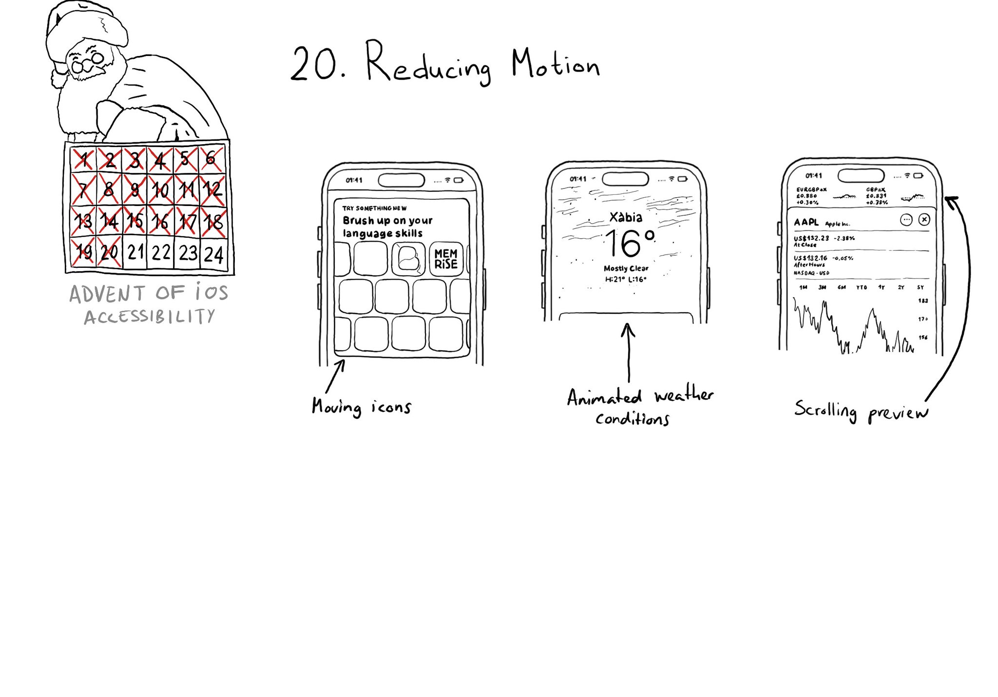
There is an option for the user to request an experience with Reduce Motion and we should honor it. If your app has animations, make sure to check if the user has this setting on. Here are three examples where Apple does a great job.
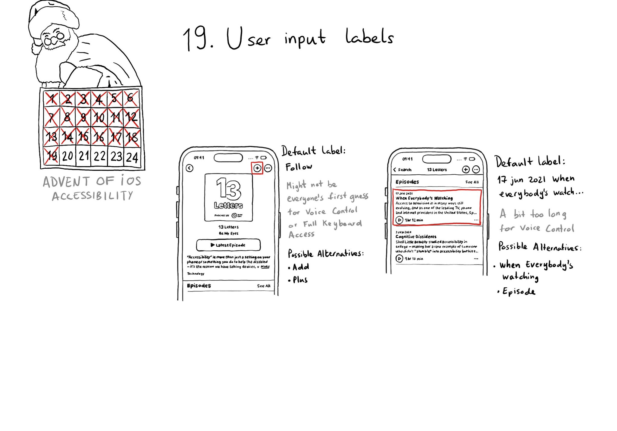
Accessibility labels might not be the best input labels, used for example to find or interact with elements with Voice Control or Full Keyboard Access. In those cases, you can provide accessibility user input labels.
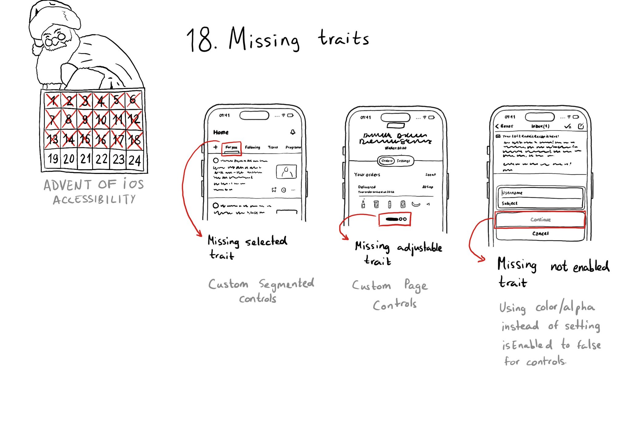
When building custom components, or if not relying on UIControl's attributes to configure state, it can be easy to forget to specify the right accessibility traits. These are indispensable for a good experience with VoiceOver, Switch Control...
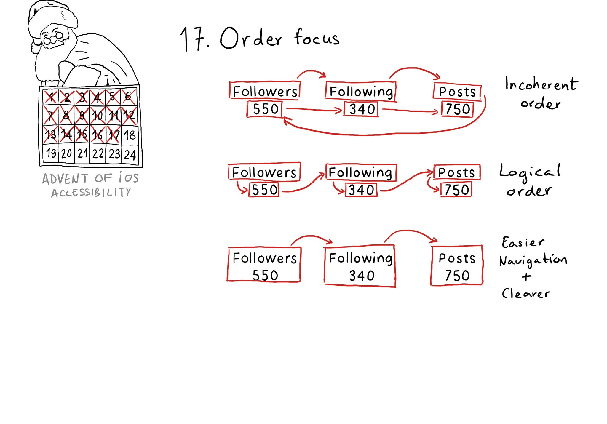
Check for the traversal order of elements in your app. Sometimes, the default top-left to bottom-right order might not be the most logical one. Sometimes, you may consciously want to tweak the order. Some other times, grouping is the answer.
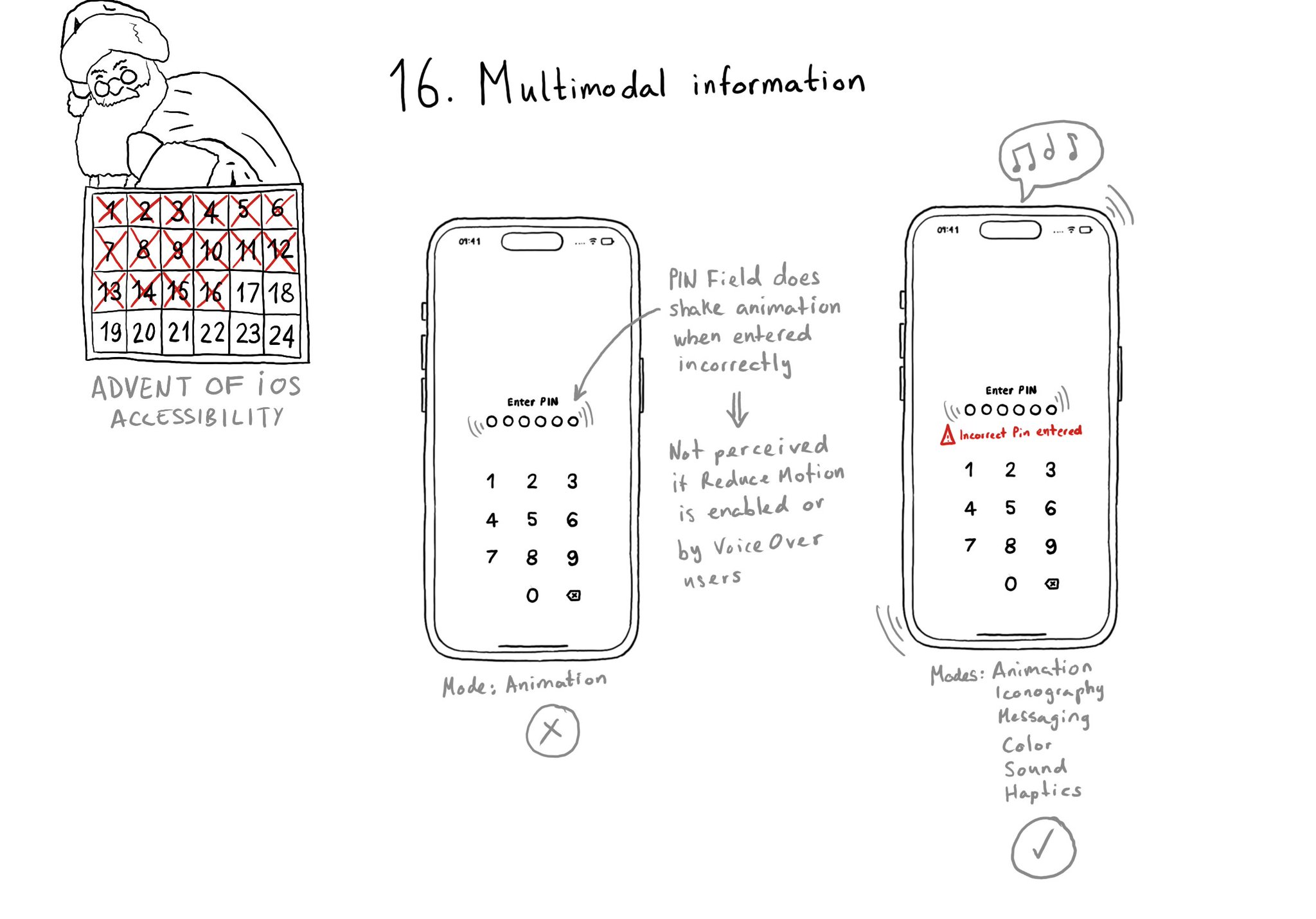
A reminder that the more modes we use to convey important information, the more sure we'll be that it will be perceived by all our users. Consider a combination. of color, icons, messages, sound, haptics, animations, etc.
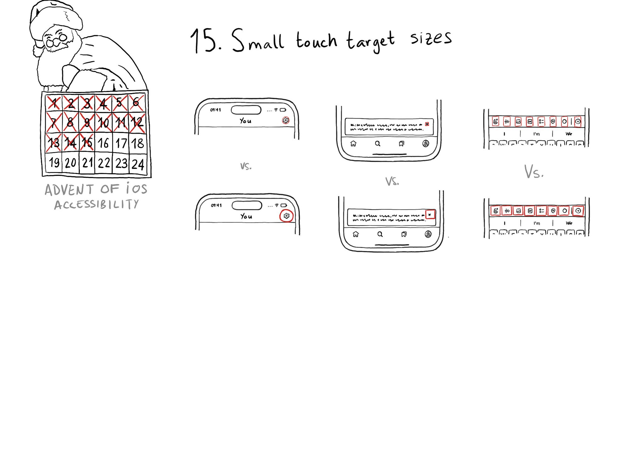
Touch target sizes are recommended to be at least 44 x 44 points. Buttons in the navigation bar ( especially when not using nav bar button items), dismiss buttons, and custom toolbars, are use cases that tend to have smaller sizes.
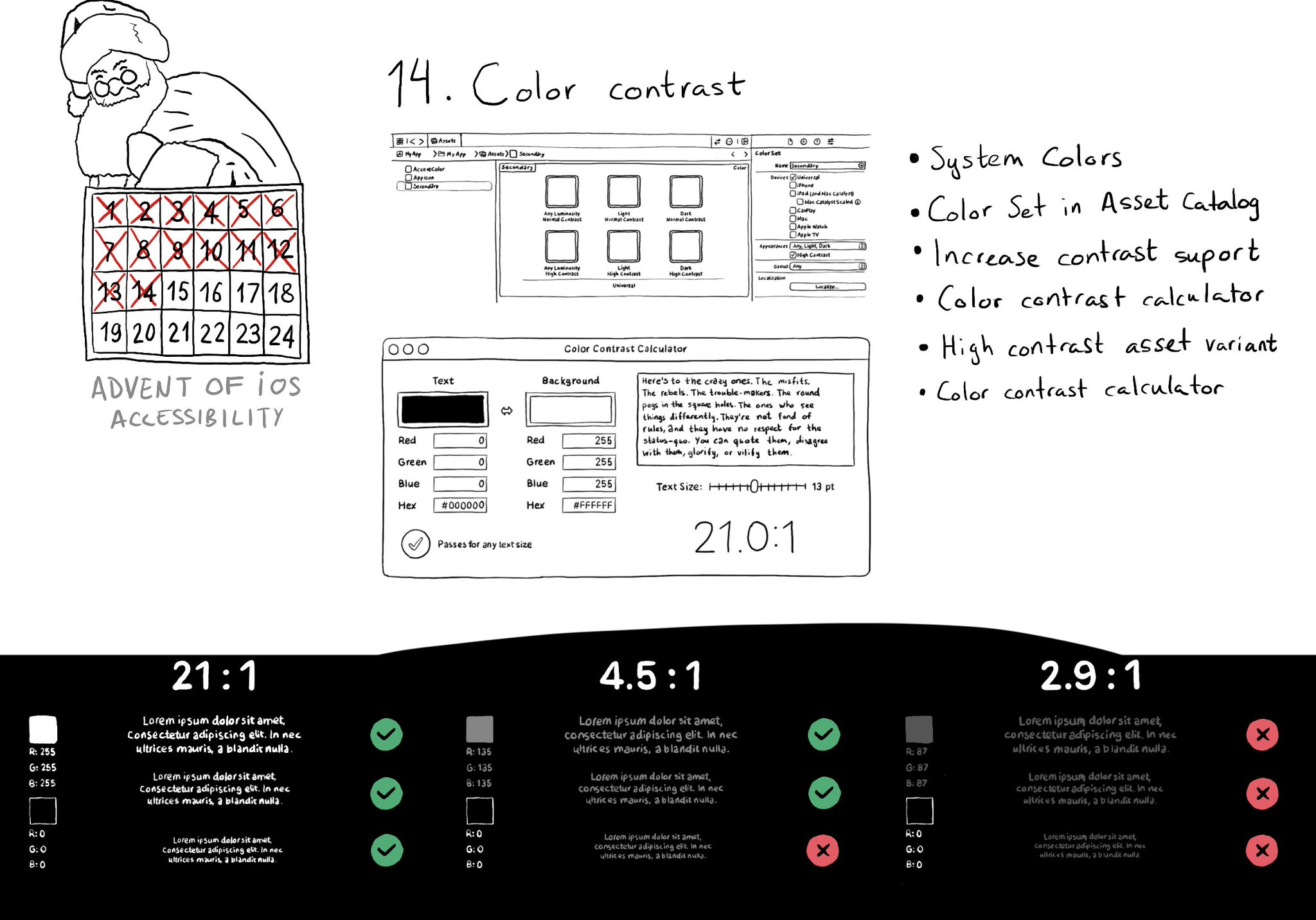
iOS and Xcode provide a wide variety of tools and options to deal with color contrast ratios. From system colors, that automatically support Increase Contrast, to high contrast color and asset variants, and even a built-in contrast calculator.
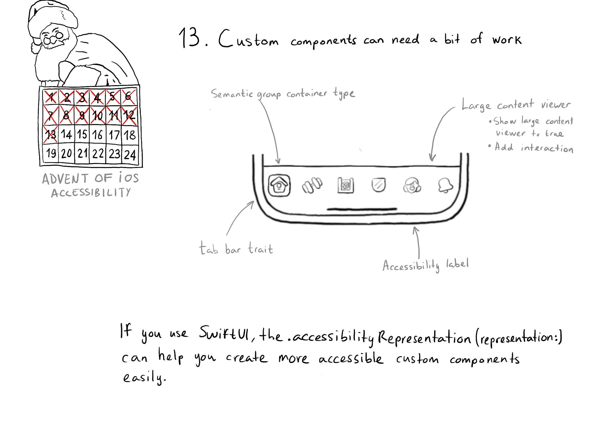
Sometimes, you may want to create a custom component, even if there is a similar one in UIKit because you want to style it in a way that the default one won't let you. That's fine, just take into account that you'll need to make it accessible.
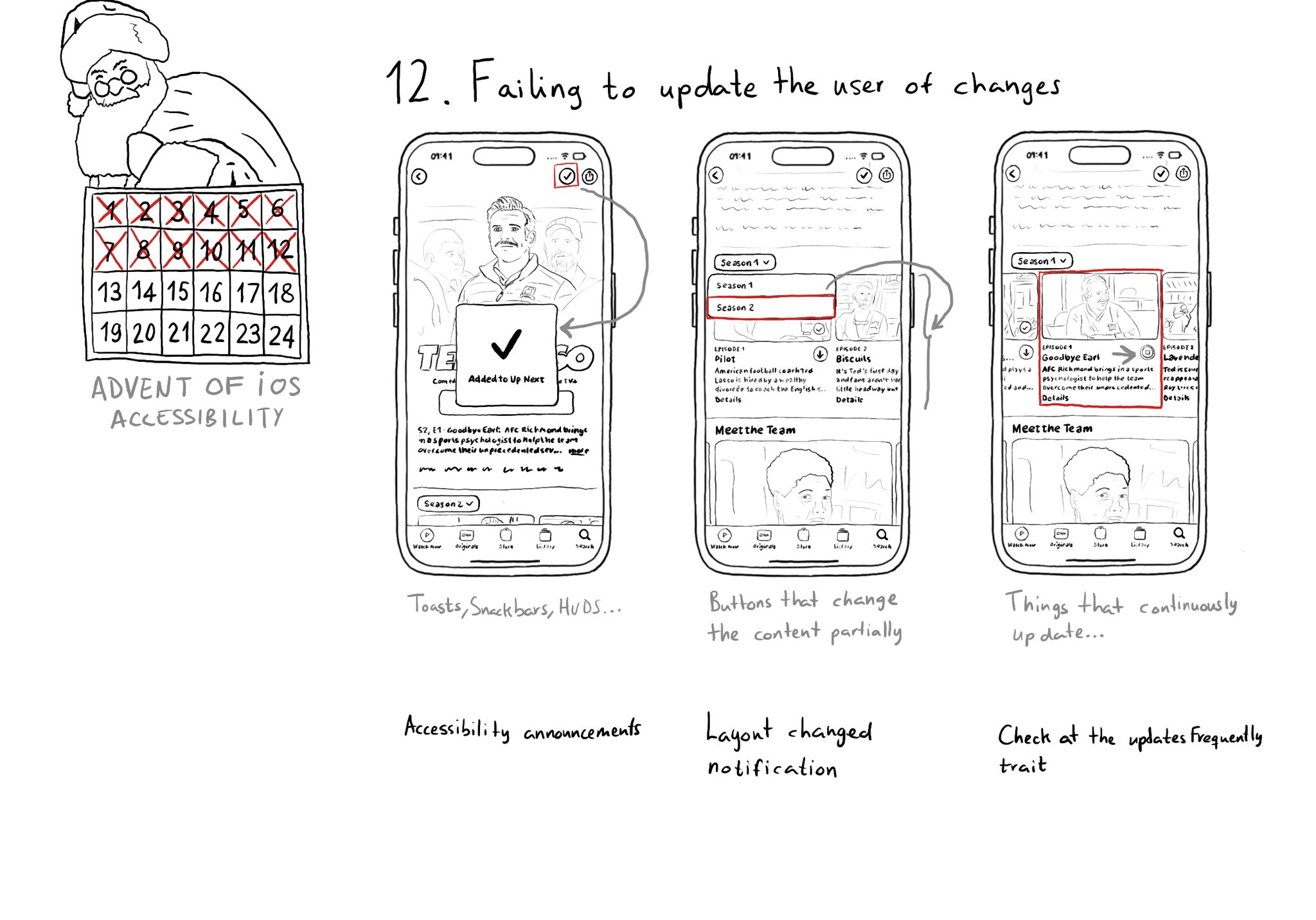
Sometimes we may fail to convey to the user of things changing on the screen in a perceivable way. Toasts and similar should be announced. We may want to make clear that some content on the screen changed. Or we might want to update on progress.
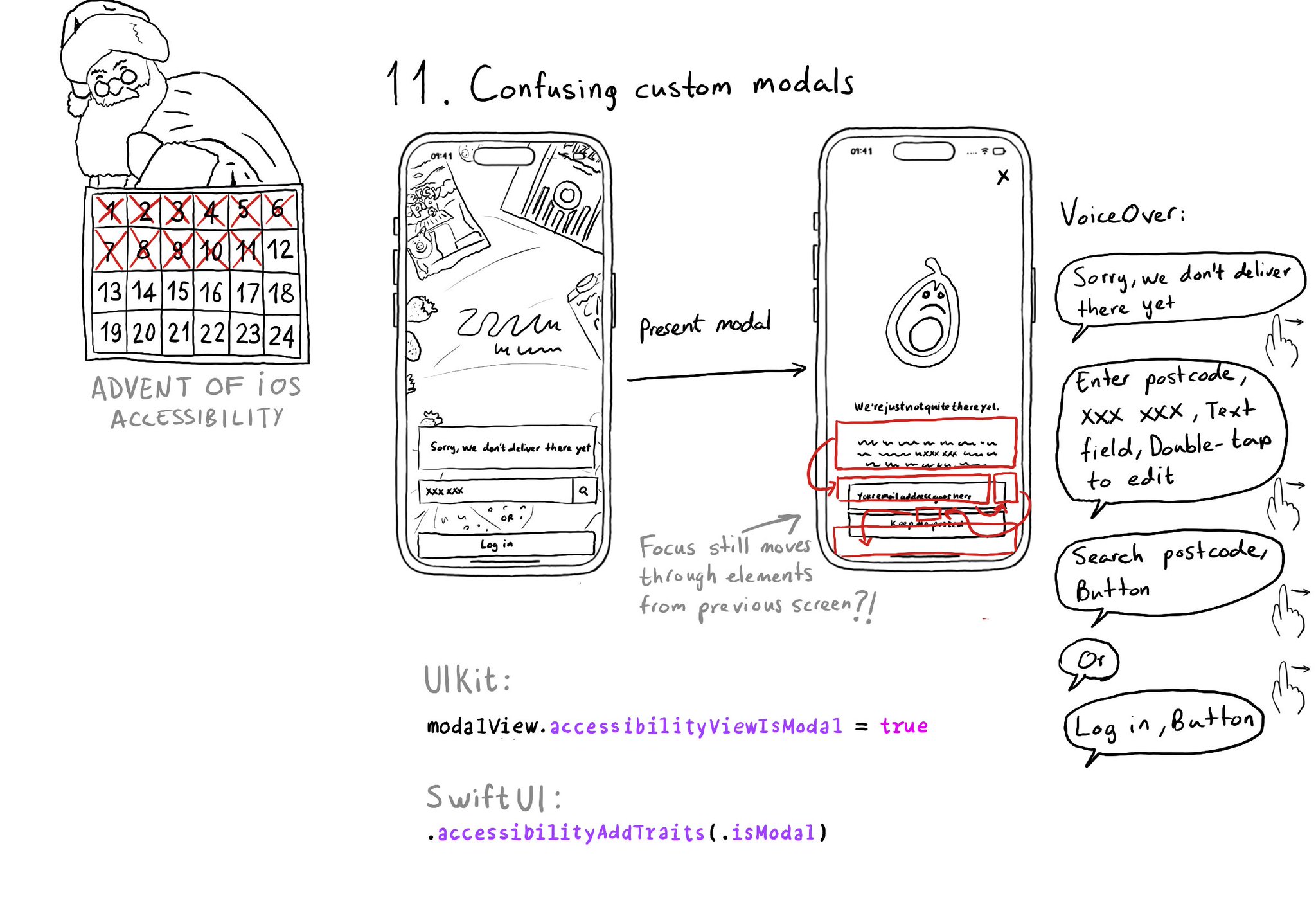
Have you ever seen VoiceOver randomly focusing on elements of the previous view when presenting a custom modal view? That can be fixed by letting the system know that the presented view is modal in terms of accessibility.
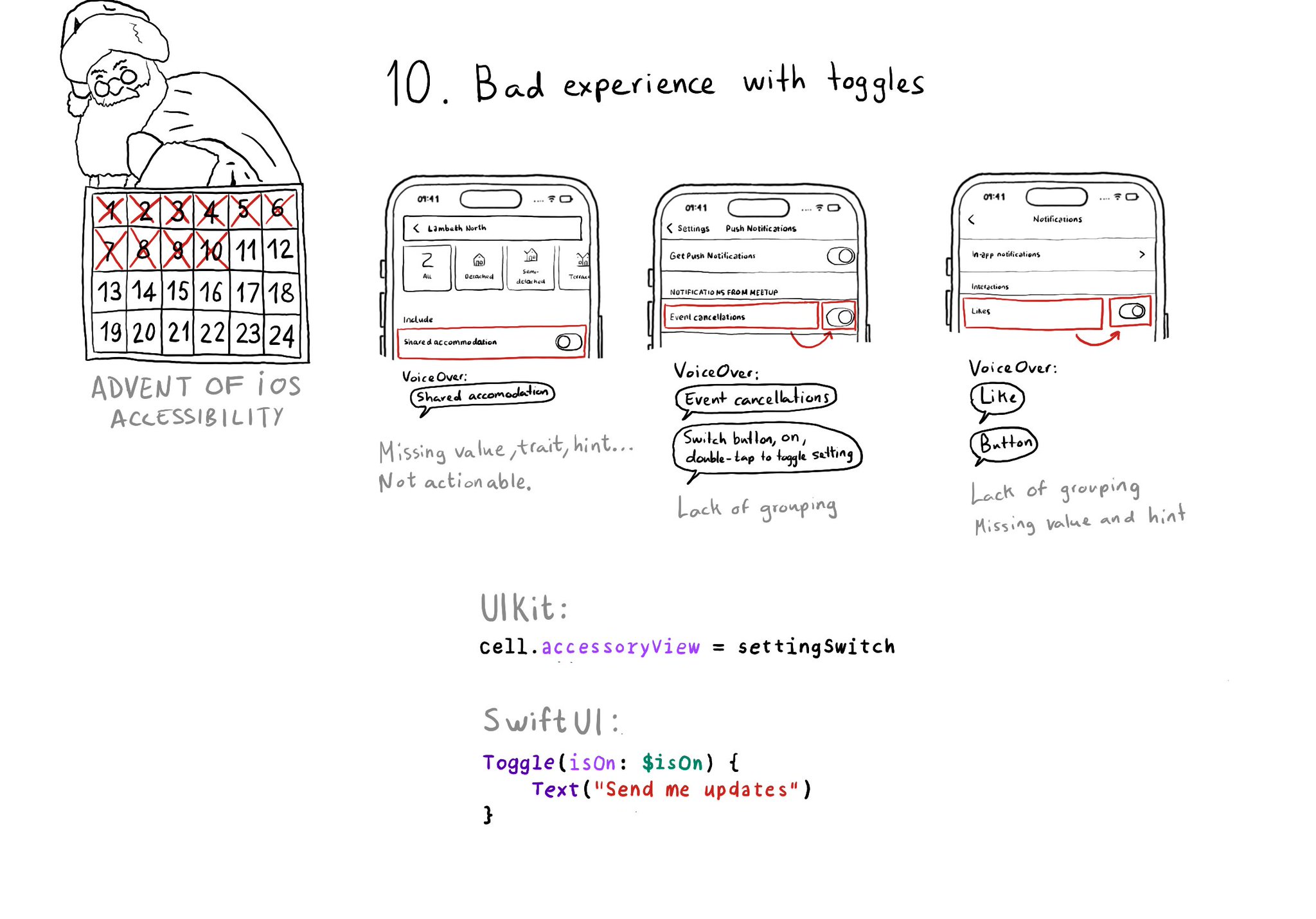
Toggles or UISwitches are often found separated from the label that precedes (and describes) them; with an unclear label; missing a value, trait, or hint; or even not being actionable at all.
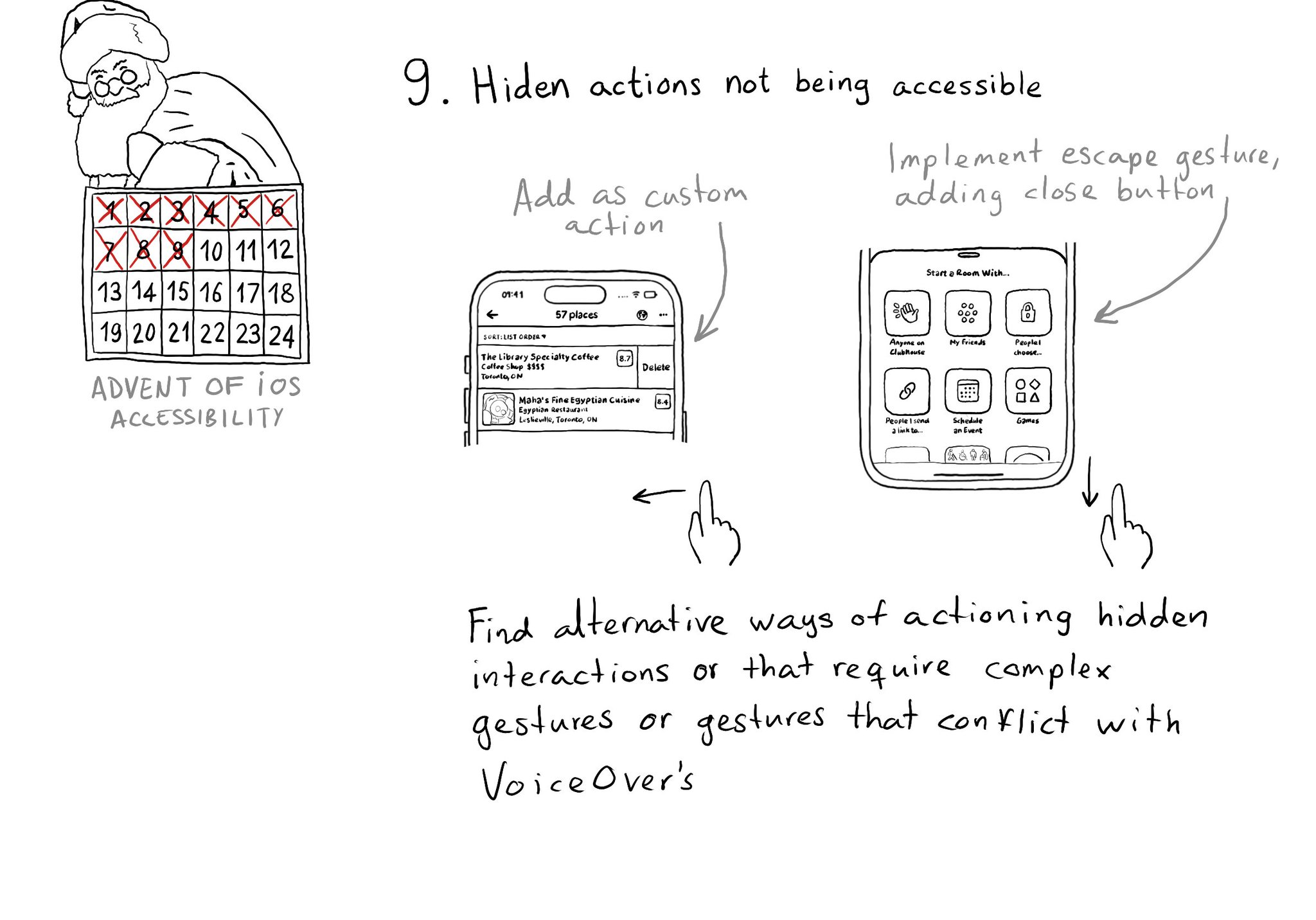
If you have interactions that are hidden or require complex gestures to be performed or that may conflict with VoiceOver, you need to provide alternative ways of executing these actions. Custom actions can help a lot of times, but not always.
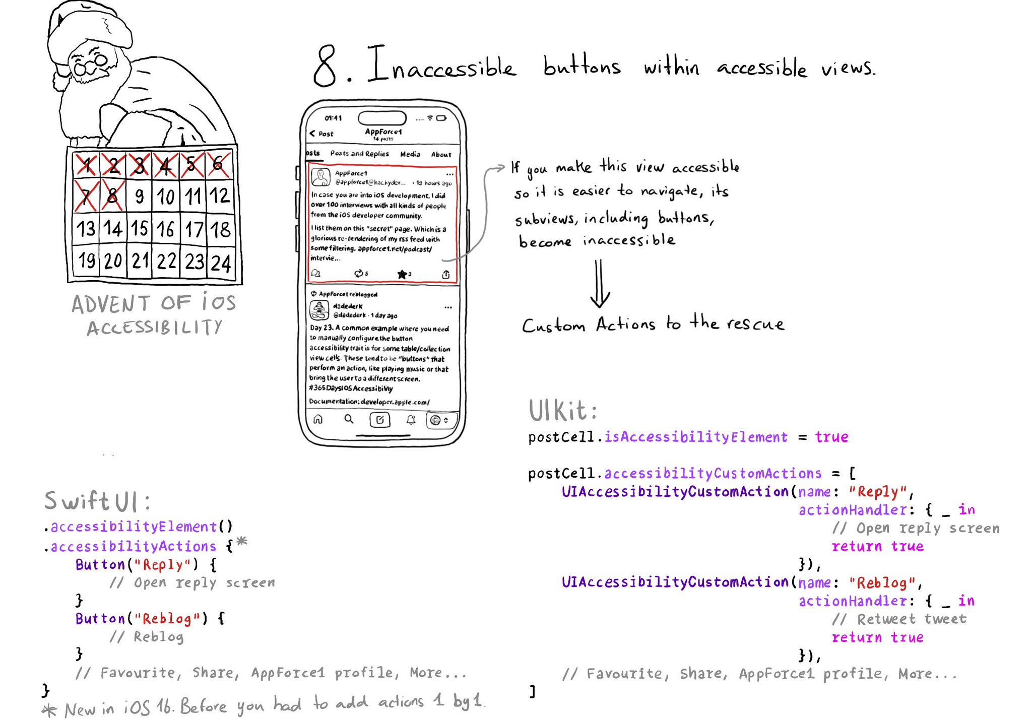
If a view has isAccessibilityElement to true, assistive tech won't look for any of its subviews. That means that if there are any buttons inside, they won't be accessible. You can add custom actions to that element though.
Showing 16-30 of 230 posts