Tips and tricks to build accessible iOS apps
#365DaysIOSAccessibility
A year-long journey exploring iOS accessibility, one day at a time. Each post shares practical insights, tips, and techniques to make your iOS apps more accessible.
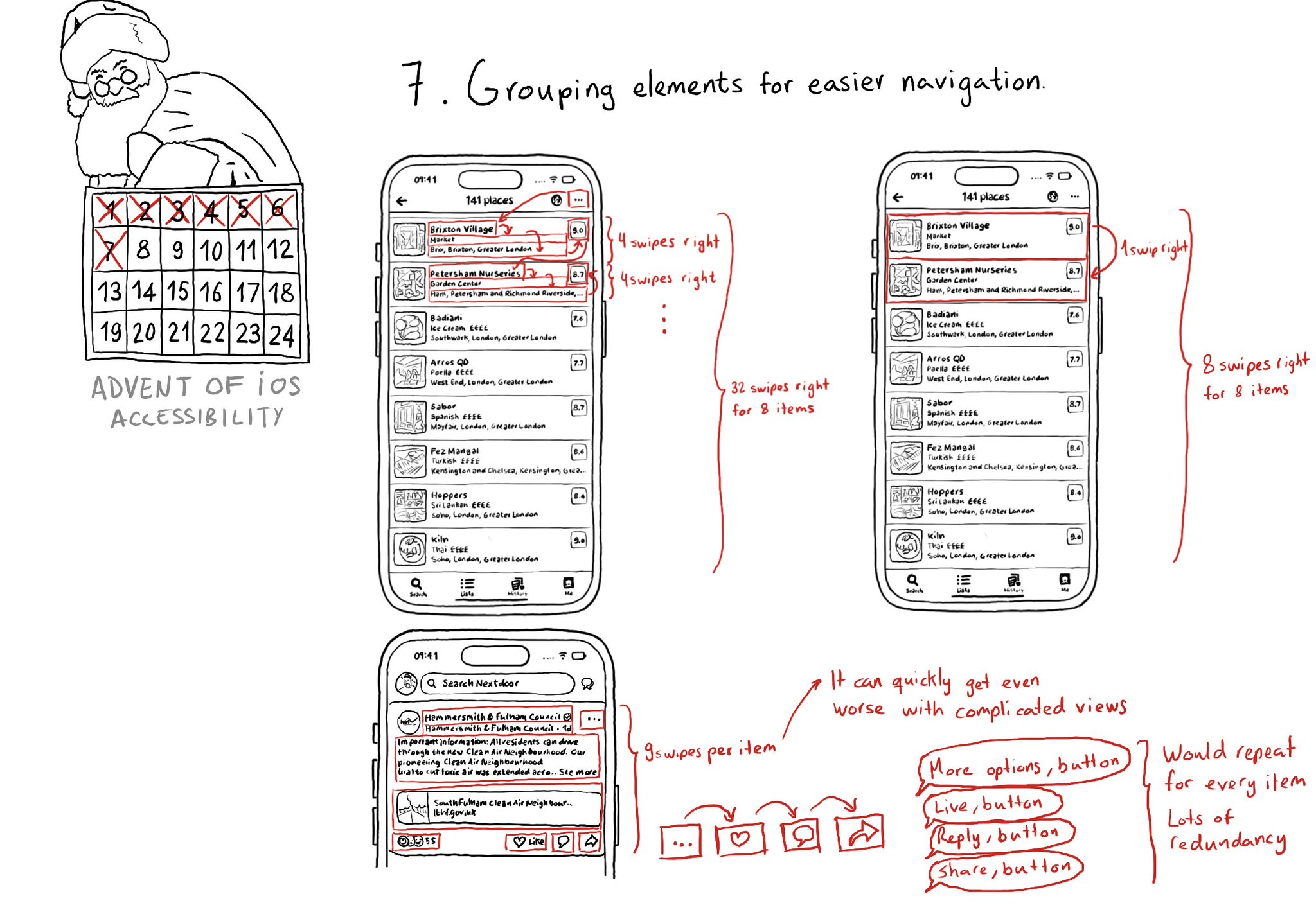
Grouping elements when it makes sense can make a huge impact on easing navigation with some assistive technologies like VoiceOver, Switch Control, or Full Keyboard Access. It also helps on reducing redundancy.
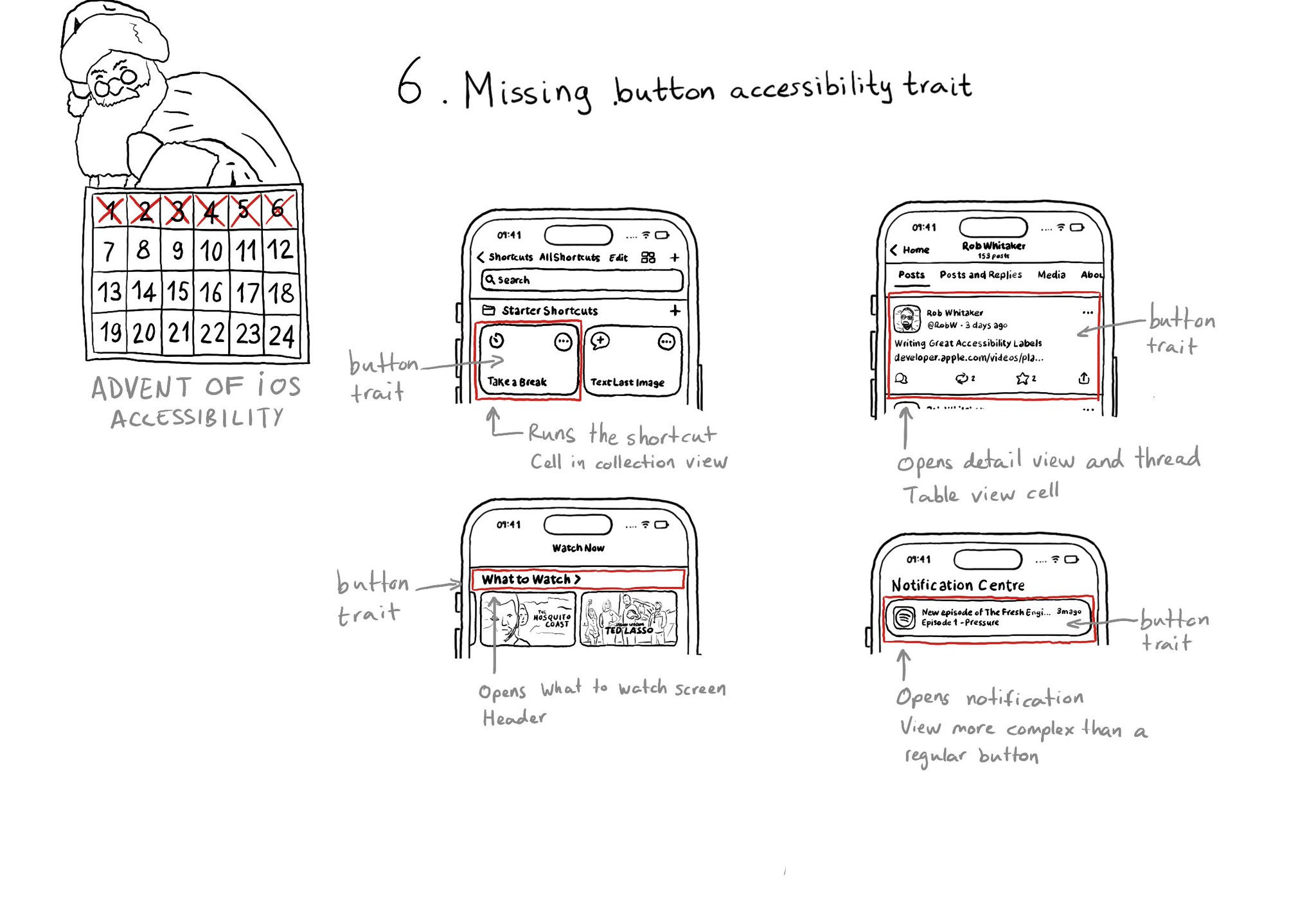
With regular buttons from UIKit or SwiftUI, you are all set. With complex views, headings, or table/collection view cells that, when selected, bring the user somewhere else in the app or perform an action, you'll have to add the button trait.
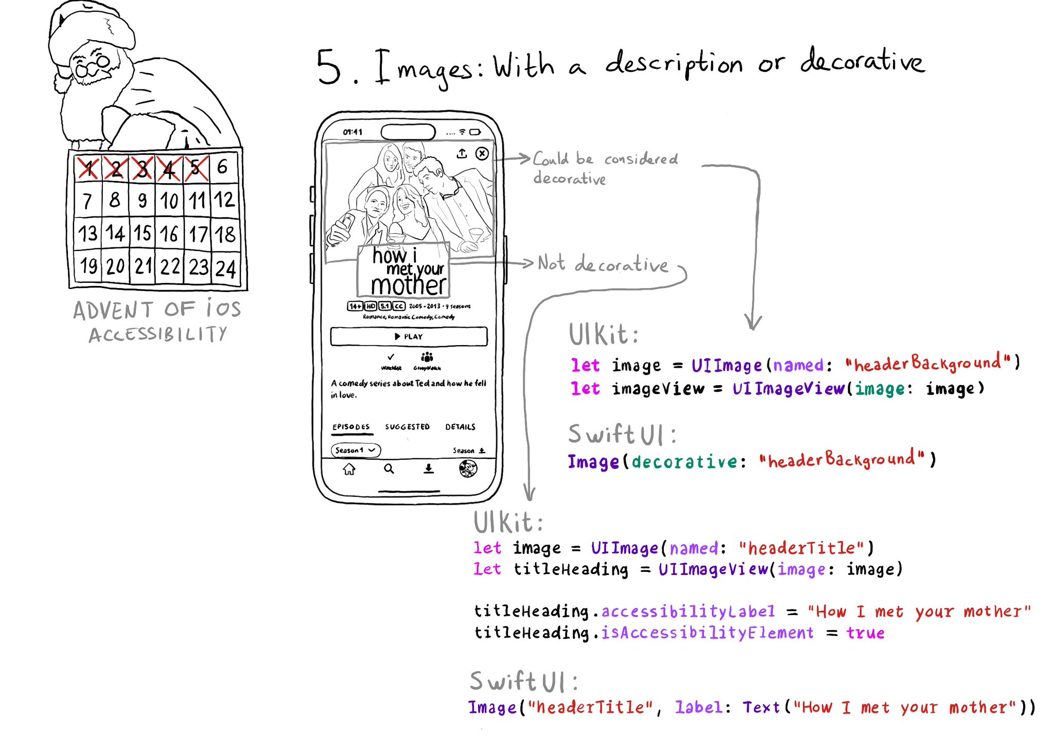
Images should either be decorative or have a proper accessibility label or alt text that describes them. If they're decorative you can make it so they get skipped by assistive tech so it doesn't get in the way of the experience.
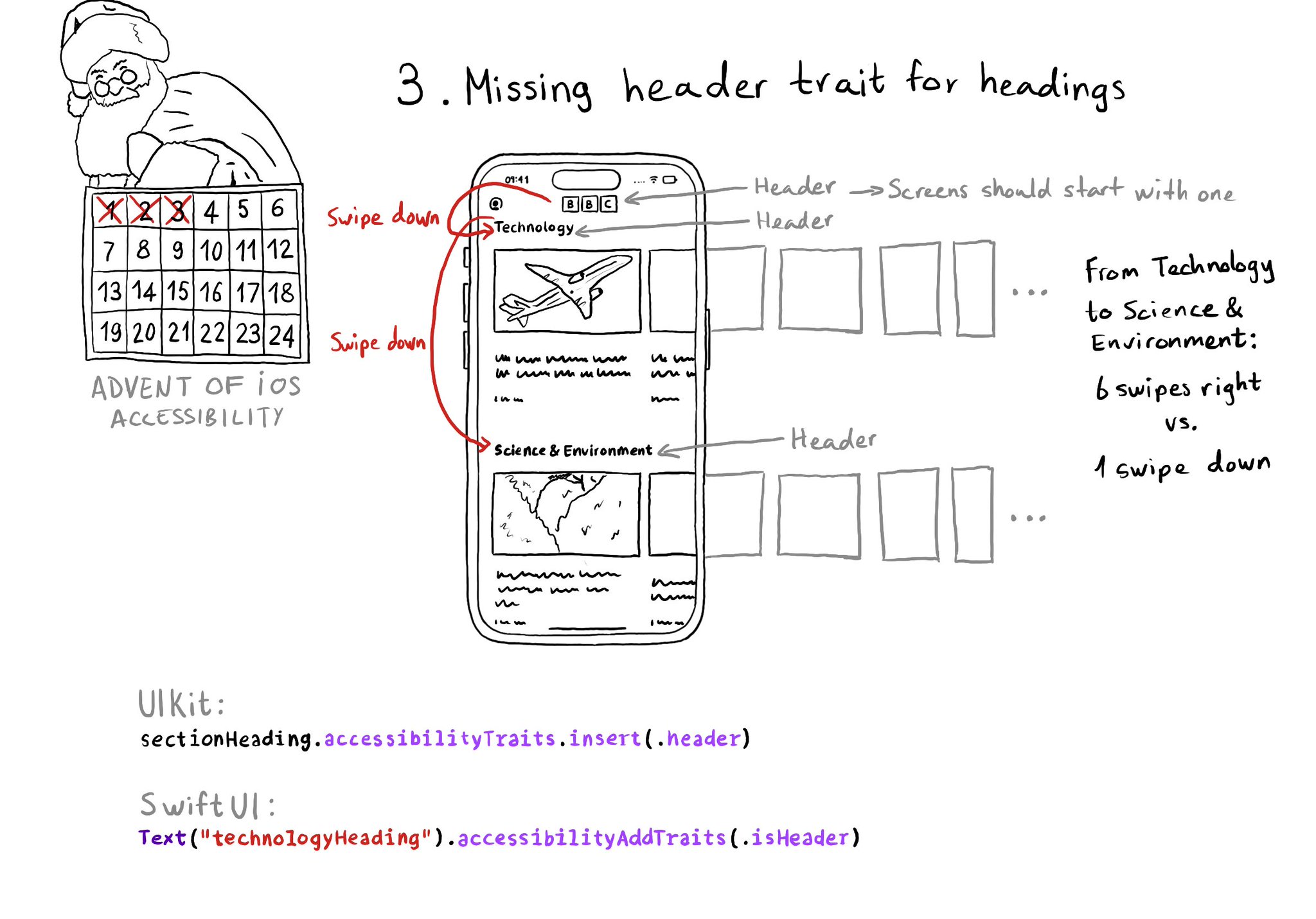
Anything representing a heading in the app should have the header trait. It allows for a faster way of exploring a screen and jumping to the part of the app you are interested in. Screens should also start with a header.
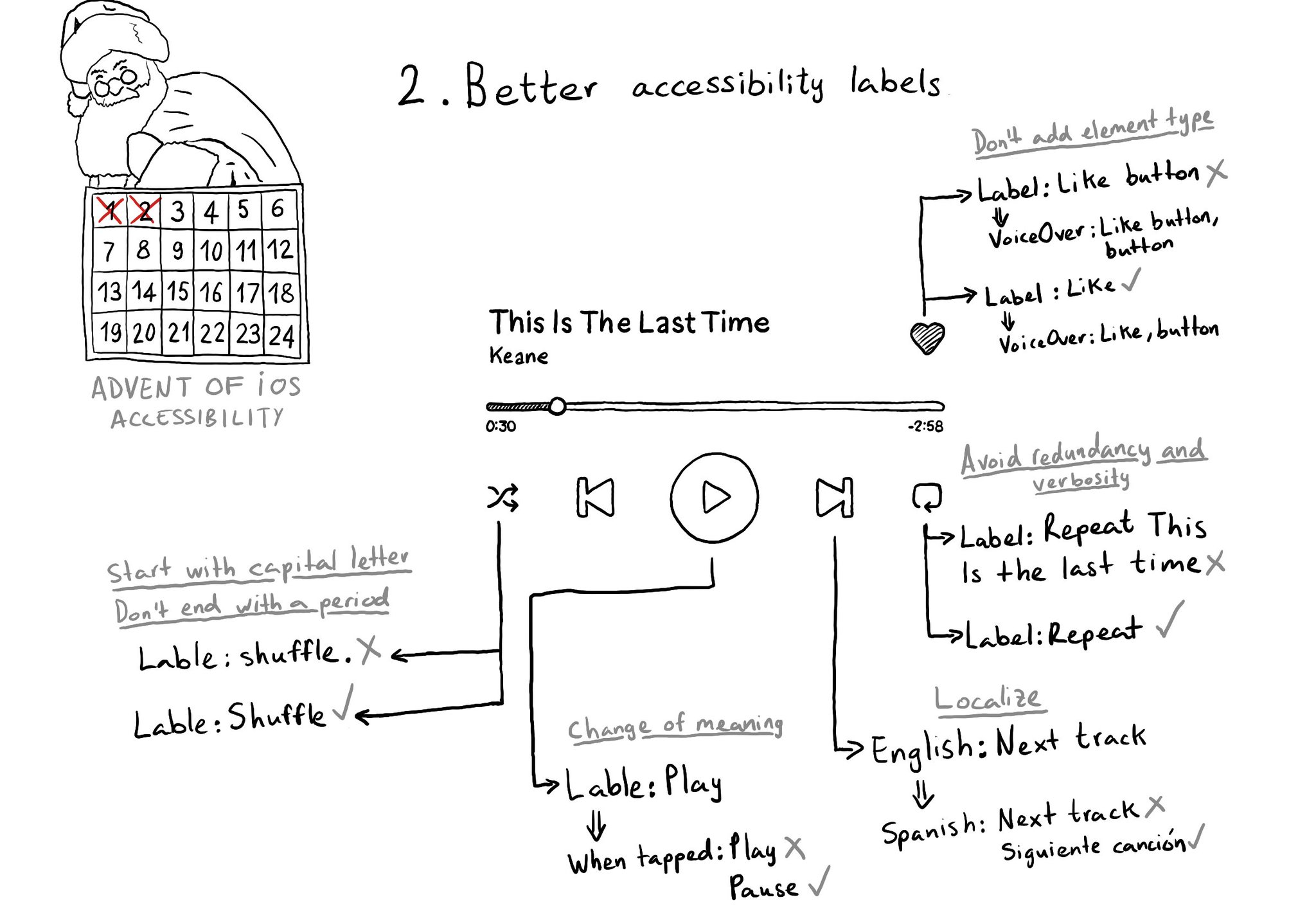
Some recommendations for improving your accessibility labels: don't add the element type, avoid redundancy and verbosity, localize... @MobileA11y has an excellent blog post on it: https://mobilea11y.com/blog/writing-great-labels/ @jordyn2493 has a great video too: https://developer.apple.com/videos/play/wwdc2019/254/
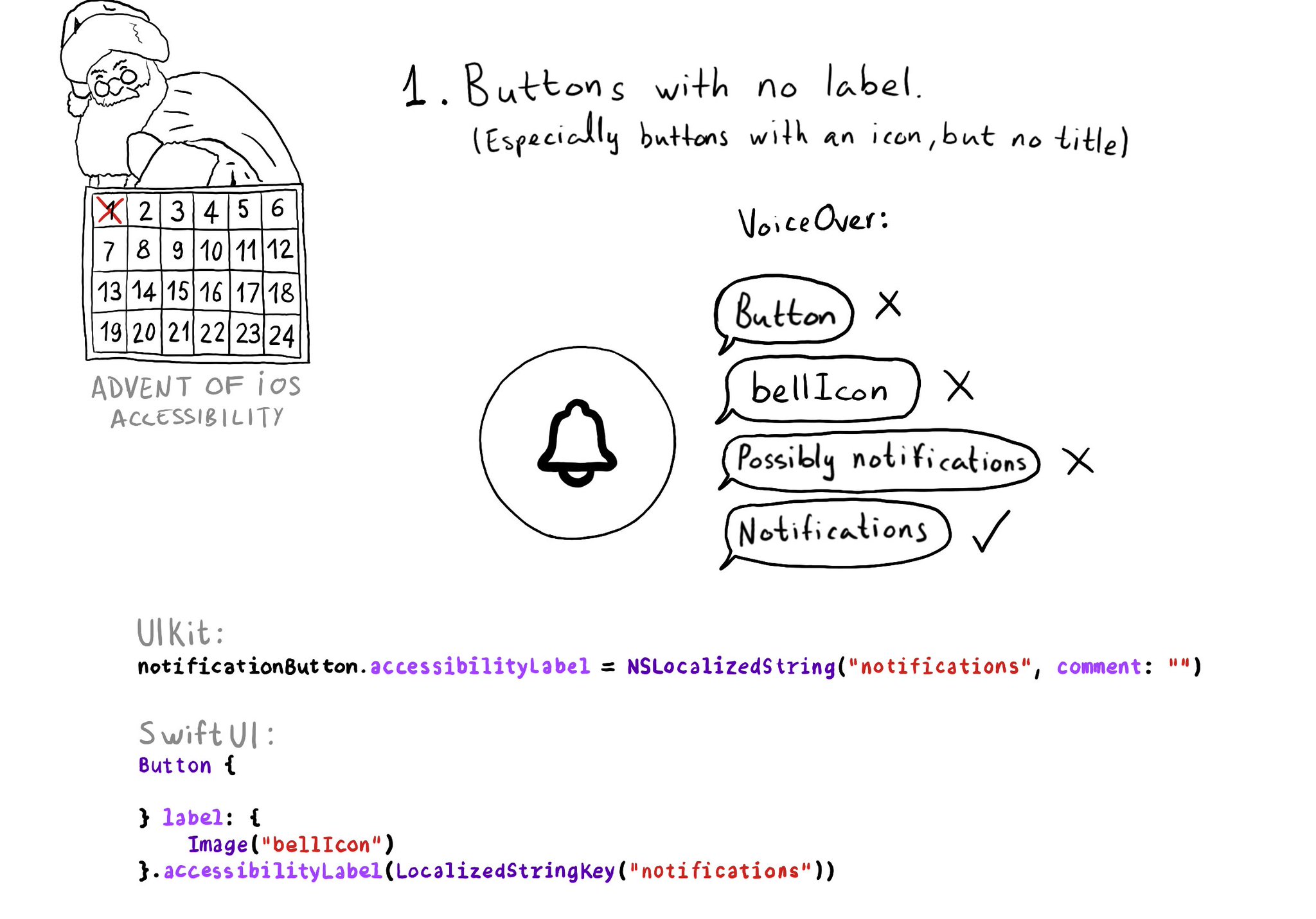
One of the accessibility issues I see more often in iOS apps, believe it or not, is unlabelled elements. This happens especially for buttons with an icon but no title. In those cases, you need to configure an accessibility label manually.
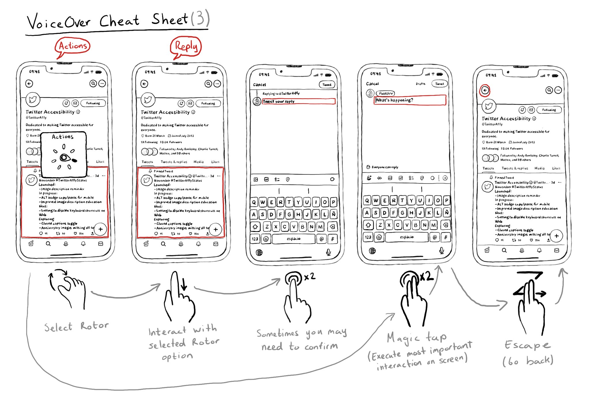
Once you learn some basic gestures with VoiceOver, it is very important to master he Rotor. It is very useful to also know some more power user gestures like the Magic Tap or the Escape gesture.
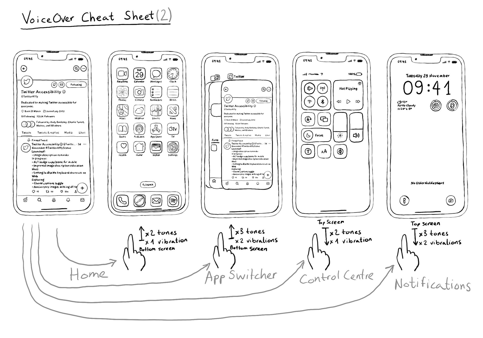
When using VoiceOver on a device without a home button it can first be confusing how you can do a few things, including going to Home from an app, or opening the App Switcher, Control Center, or Notifications. Here's a quick guide for you.
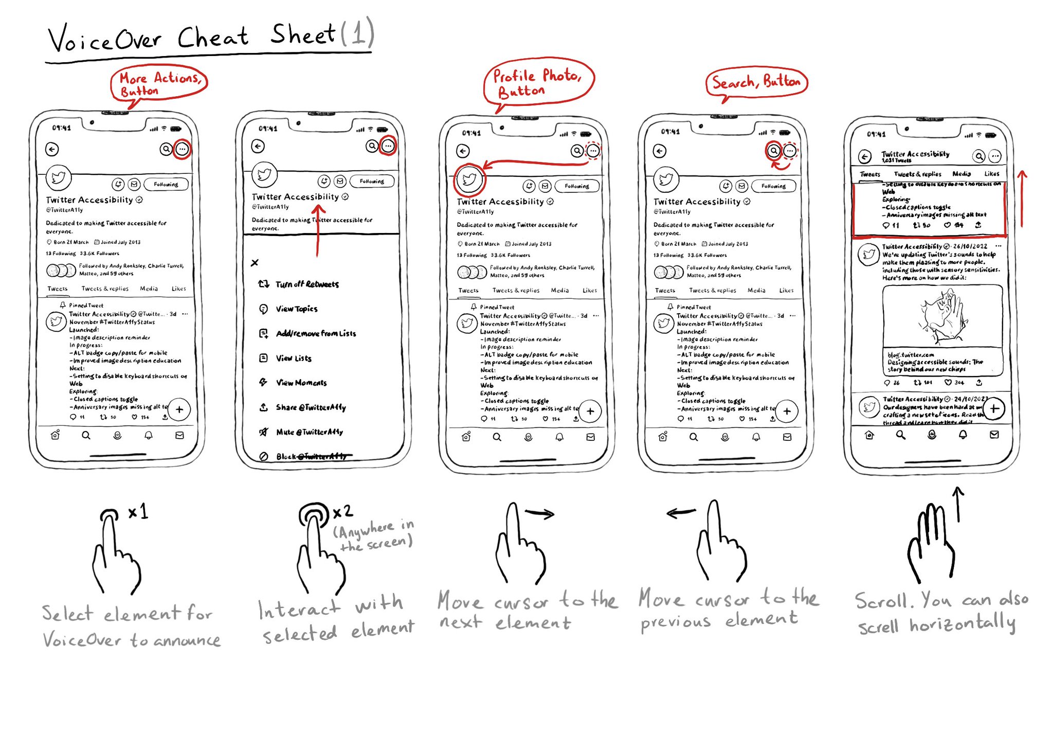
Let's quickly remember a few of VoiceOver's most important gestures that will let you do some of the most basic actions including selection, interacting, navigating, and scrolling. And Apple has a great video: https://m.youtube.com/watch?v=qDm7GiKra28&feature=youtu.be
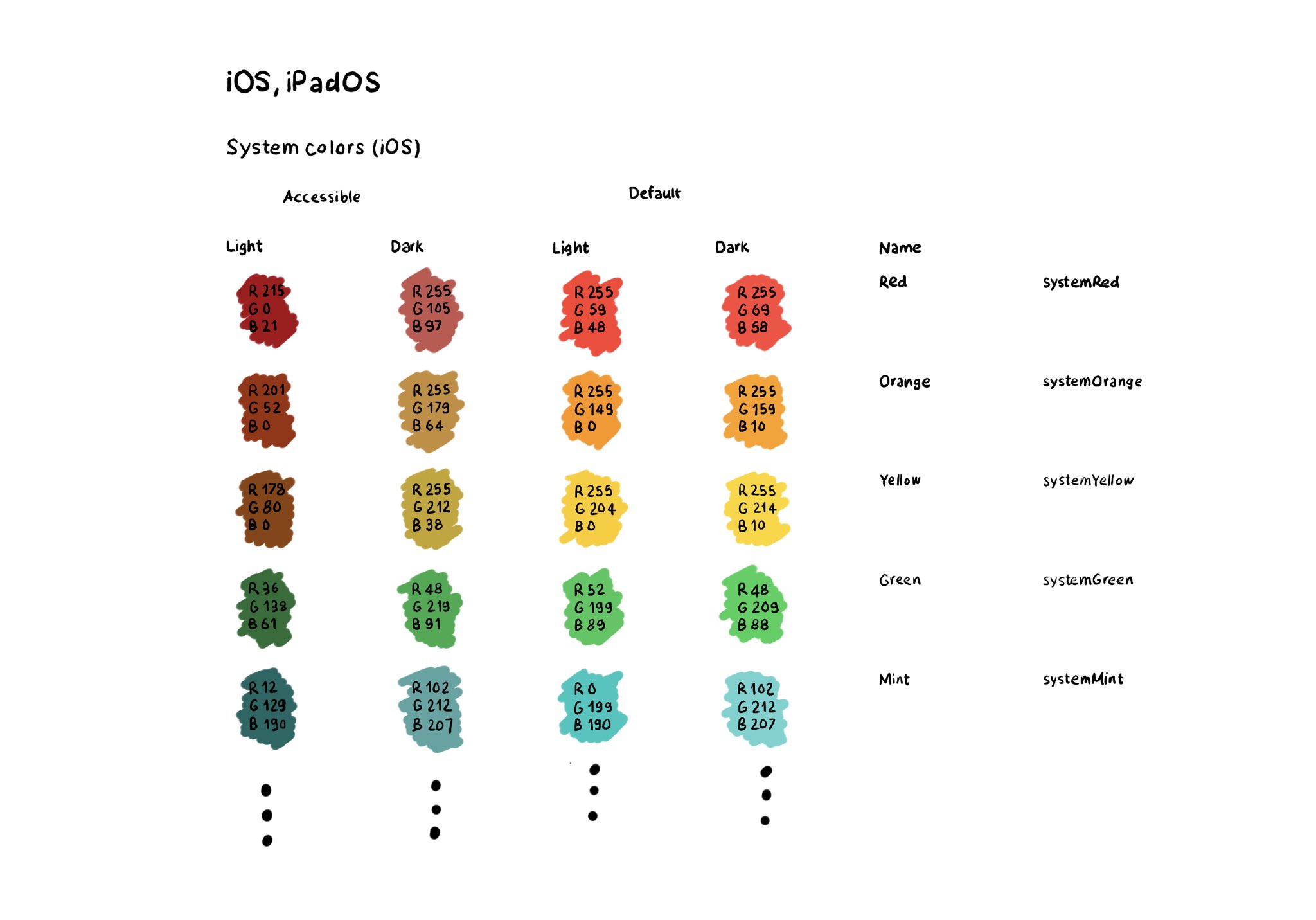
The most straightforward way for making sure your colors work well in all appearances (dark, light, increase contrast, and all the combinations) is to use the provided system colors. Check the background and label semantic colors too. All the info in the Color section of Apple’s Human Interface Guidelines: https://developer.apple.com/design/human-interface-guidelines/color
If you don't use Color Sets in your Asset Catalog, and you define your color palette in code, you can still check if the user has Increase Contrast enabled to offer a slightly different color that improves the contrast ratio even more. Day 192 (2/2). You can check if the darker system colors is enabled: https://developer.apple.com/documentation/uikit/uiaccessibility/isdarkersystemcolorsenabled Listen to a notification in case this setting changes: https://developer.apple.com/documentation/uikit/uiaccessibility/darkersystemcolorsstatusdidchangenotification And also check if the accessibility contrast is high in your trait collection: https://developer.apple.com/documentation/uikit/uitraitcollection/accessibilitycontrast
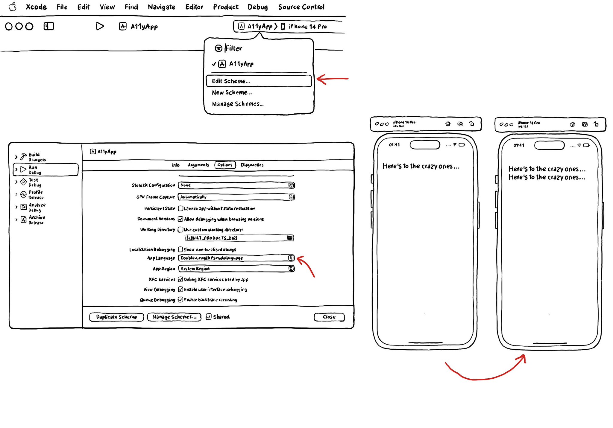
I recommend running your app with Double-length Pseudolanguage. It is a great way to stress-testing your app and see how adaptive it is and if your UI will hold to other languages that might be a bit more verbose or even with larger text sizes.
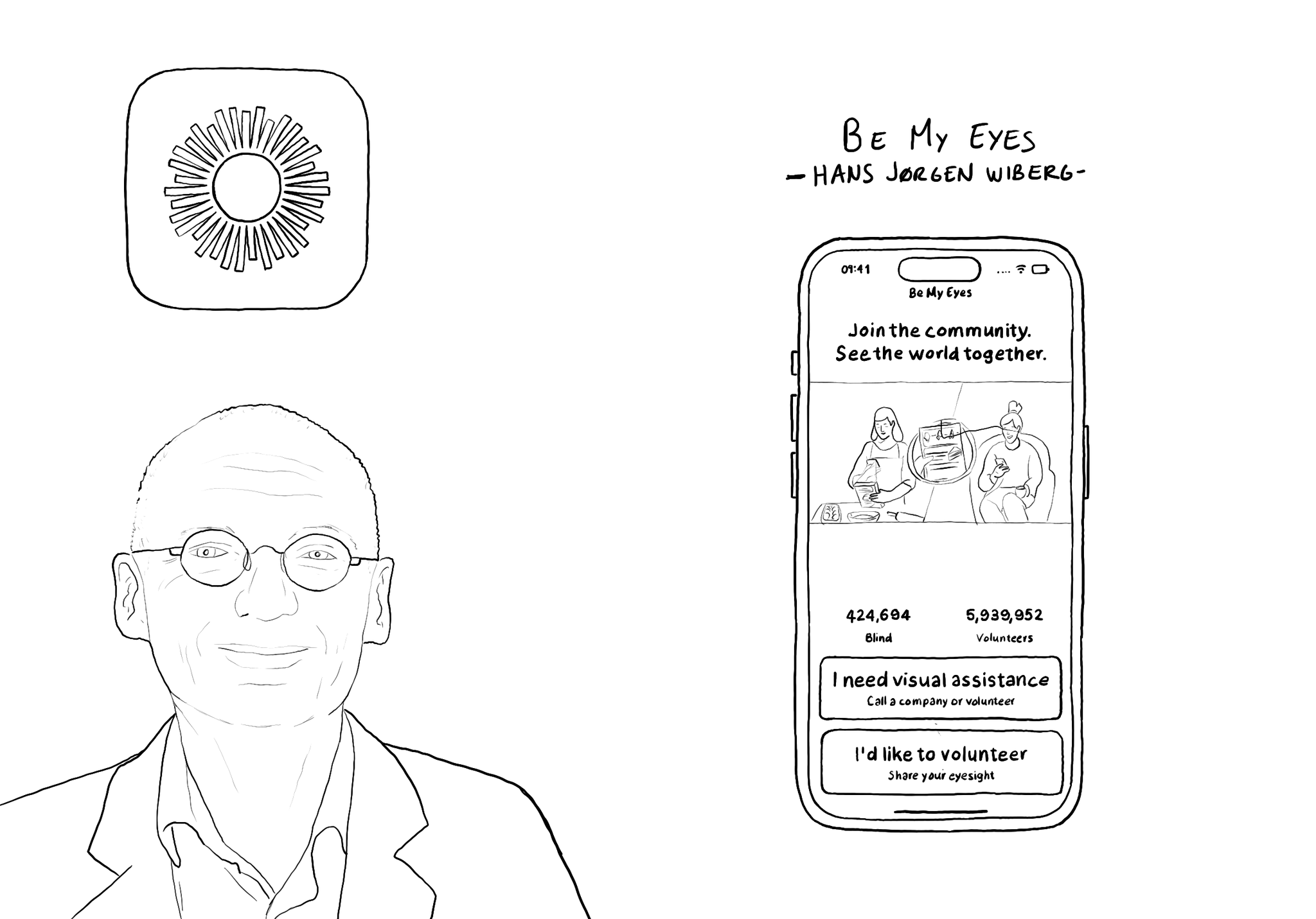
@BeMyEyes, founded by @hjwiberg, enables people who are blind and low vision to identify objects by pairing them with volunteers from around the world using their camera. Winner of an Apple Design Award 2021 for Social Impact.
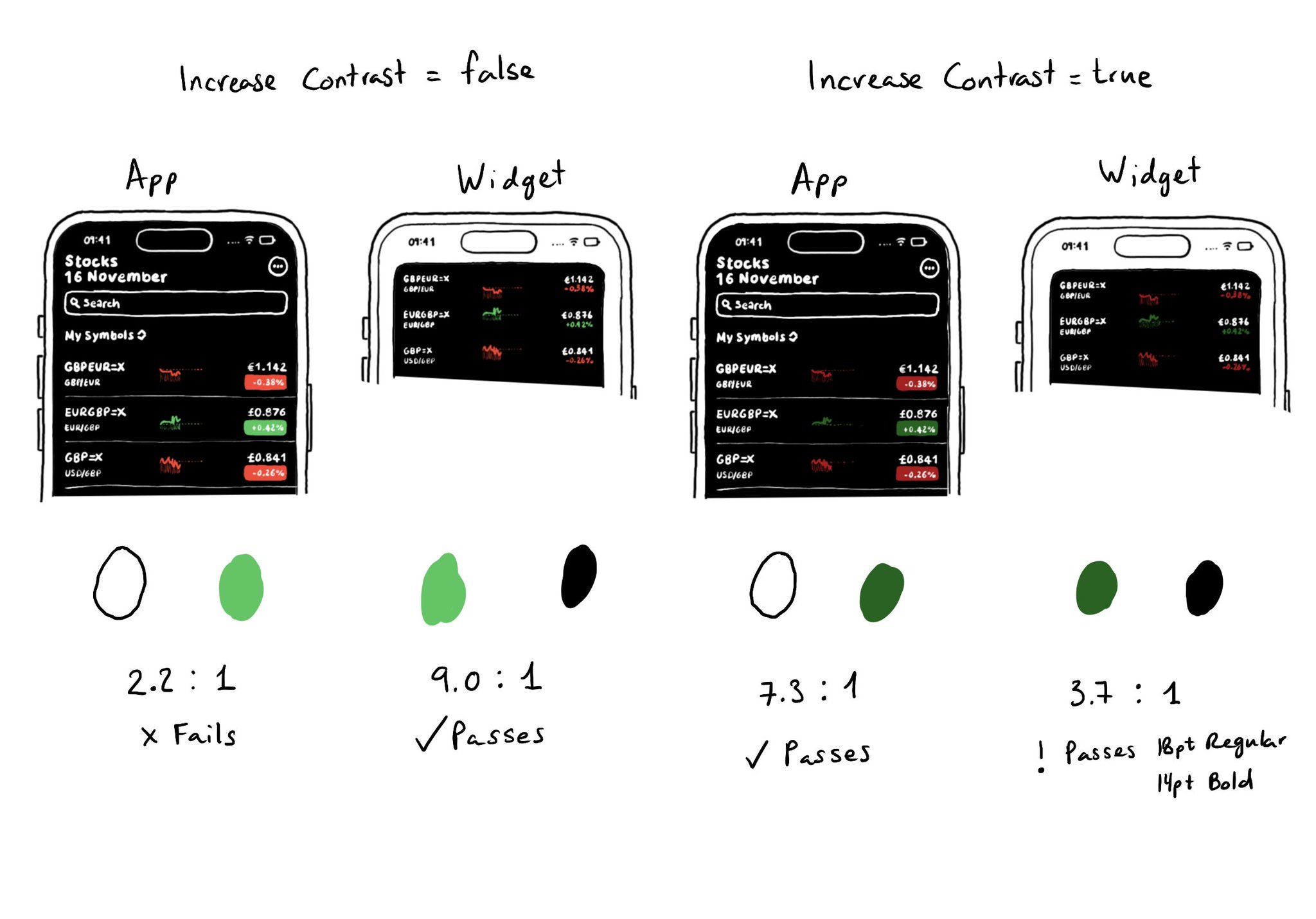
Sometimes it won't be enough to make colors darker or lighter for Increase Contrast. As always, it is important to do some testing. The same colors might be used with different backgrounds or text colors and the contrast could actually get worse.
You can enable the possibility of providing assets for different appearances including light/dark modes and high contrast. As we've seen, that's valid for colors, but you can do the same for images too! https://x.com/dadederk/status/1594724075590619138?s=20&t=XJrlJiGSCTR9sJC7XPZPjA
Showing 31-45 of 230 posts